Archives for category: toronto

This piece was found in an old yahoo email account. It’s an itemized list of the sents/sounds/sites of Toronto’s old streetcars, written in anticipation of their retirement in 2024

From the outside

The geologic thunder
The ca-clunk ca-clunk
Not being able to see them from a distance
Their green lights fading into traffic lights. Their weak front headlight barely visible as it trundles into oblivion and obsolescence
Stuck behind a turning left car

From the inside
The shuttered click of the back doors, the air releasing as they shut
The squeak of the back motor
The complete silence when that motor turns off
The buzzing sound of the street car moving forward
It’s forward momentum
It’s gentle ascending tone and descending tone when slowing down
The ding of someone pulling the rope to alight
The barely lit stop request sign
The friction of the sliding window
The keep arm in medallion
The availability of the driver, sharing the same space
The release of air as the front doors open
The clink of change in the fare collection box and the drop off them all into the main pile
The thud of shoes on the plastic floor and up and down the stairs
The dinging gong as two streetcars pass each other
The fierce horn at a errant car passing it’s open doors, fiercely defending the street
The click of the back door steps confirming they will open after a slight delay

The too hard to reach pully strung stops

Guest post by Natalie Logan, a documentarian, artist, and aspiring urban geographer

What’s the difference between the woods and a forest? Scale. Then how relevant that the area south of Cedarvale and west of Forest Hill is called “The Woods”?

Most people know this area as Humewood but there is something more poetic with the vagueness of calling it The Woods and dropping the specificness the prefix “Hume” creates. Think of other areas of Toronto that conjure up that kind of feeling, like The Island or The Beaches (though, apparently locals call it The Beach, and technically The Island is really a bunch of islands).

Insiders call their area The Woods because they are familiar with its street names. From the east to west you have Kenwood, Wychwood, Pinewood, Humewood, Cherrywood and from the south to north you have Wellwood, Maplewood, Valewood. According to the Wikipedia article the given boundaries are Bathurst Street on the east, Eglinton Avenue to the north, Arlington Avenue to the west, and St. Clair Avenue to the south.

natdy
I grew up in the “epicentre” of The Woods. At least a decade of my childhood happened at 24 Pinewood Ave and I currently live off of Wychwood Ave. So I think I have some credibility here. I would expand the boundaries of this area to extend south of St. Clair to the bottom of Davenport because of the Wychwood barns and Wychwood Park, and I would also expand the boundaries as far west as the most recognizable wood named street in the area, Oakwood Avenue. Why leave Oakwood out? Arlington is such a puny side street by comparison and all the other streets that make up the official boundaries are major.

What is interesting about the Wikipedia article on The Woods isn’t just that it challenged my understanding of the boundaries of my neighbourhood, but also the comparison it made between the wealth of the surrounding neighbourhoods. It pits “wealthy Cedarvale in the north” against “the upper middle class Humewood in the south” – they should have said ‘lower upper class’ in the north.

Now that you know, are you going to call this area The Woods? And will you call Forest Hill “The Forest”?

How do insiders refer to your neighbourhood?

Response by Daniel Rotsztain, the Urban Geographer

I love the notion of referring to it as “The Woods” and that being in the same category as “The Island” and “The Beaches”. It elevates this part of town by acknowledging its physical geography, it heightens my expectations for beauty in inland toronto, which is often dismissed as boring, flat, ugly.

You talk about scale: are the woods smaller than a forest? Is the Woods diminutive compared to Forest Hill’s perceived might?

The wikipedia article you referred me to groups together Cedarvale-Humewood so it makes sense that eglinton is the northern boundary… but I agree that the southern boundary doesn’t make sense, and as a natural feature and real “divide’, Davenport makes more sense.

You should try and edit the wiki! That’s the whole point of wikipedia right? Tho, they might not accept your edits because the description of the boundaries of the neighbournood is based on the City of Toronto’s official definition (there are apparently 140 official neighborhoods…) which is a silly exercise because we all have our own personal geographies and definitions of where a neighbourood starts and ends. I lived in Malmo, Sweden and it was much different: each neighborhood had a distinct boundary complete with a sign demarcating where one ended and the other began!

I will definitely start calling this area the Woods, thank you for this insider info. But I don’t think I will call Forest Hill, “The Forest”. It makes more sense to me to call it “The Hills”, linking it to the area west of it, which is all drumlins: egg shaped hills left over from the glaciers

Cross-posted on Spacing Toronto, and co-written with Brendan Stewart 
Note: this article was written in the summer of 2019, and is reflection on WexPOPS, the pilot project of plazaPOPS, a high-impact, low-cost and community lead approach to enhancing strip mall landscapes in Toronto’s inner suburbs. plazaPOPS emerged from my thesis research while working toward a Masters of Landscape Architecture at the University of Guelph.  You can read my thesis here

WexPOPS is a pilot of the plazaPOPS project, an initiative spearheaded by Daniel Rotsztain, aka The Urban Geographer, and Brendan Stewart (OALA, CAHP), professor of landscape architecture at the University of Guelph, and former Associate at ERA Architects.


In an interview supporting his recent book Palaces for the People: How Social Infrastructure can help fight Inequality, Polarization and the Decline of Civic Life, NYU sociologist Eric Klinenberg points to an idea that many urbanists take for granted, but that the general public may not: “[T]he social life we experience doesn’t exist in a vacuum; there’s a context for it. It can be supported or undermined by the places where we spend time.” In other words, there is a relationship between the design of our physical environment, and the social life it enables, or not.

Klinenberg urges his readers to think about the types of places that foster connections and relationships between people and that build strong communities not as nice to haves, but rather as an essential infrastructure that buttresses the foundations of democracy, inoculating society from many of the challenges that define our current moment. He argues that “social infrastructure” will only become more critical as communities are forced to adapt to the challenges associated with climate change.

Closer to home, the Evergreen Foundation’s Towards a Civic Commons Strategy proposes a similar vision for “a network of public places and facilities that enable communities to learn, celebrate, express collective actions, collaborate and flourish, together.”

Inspired in part by these ideas, we’ve been working for over a year on an experiment to test the potential of creating a type of civic commons/social infrastructure within the ubiquitous strip mall parking lots that define the main streets of post-war neighbourhoods across the country, and which are home to millions of Canadians.

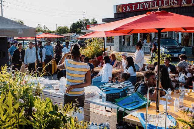
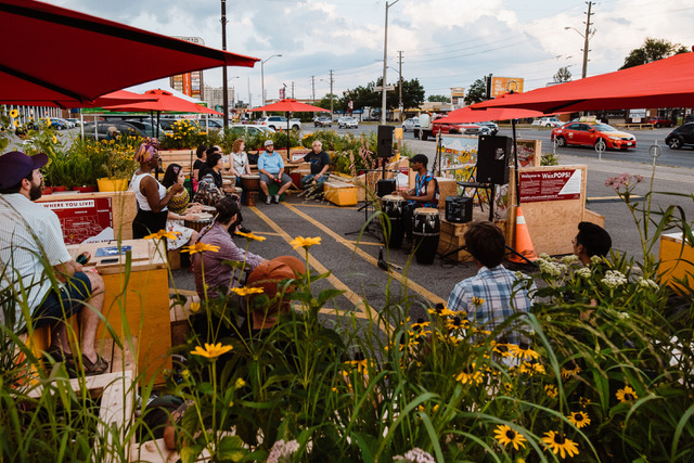
Open from July 5th to August 17th at the iconic Wexford Plaza at Lawrence Avenue East and Warden Avenue in Scarborough, WexPOPS is the result of more than a year of community consultations, planning and design work, and a collaboration involving 19 Master’s of Landscape Architecture (MLA) students from the University of Guelph, graduate business and planning students from the University of Toronto’s Rotman CityLAB fellowship program, a 15-member local working group, and a partnership with the Wexford Heights BIA.

The City of Toronto’s Public Realm Unit, Scarborough Arts, the TRCA, the Arab Community Centre of TorontoMural Roots, the Working Women Community Centre and a number of local businesses who supported the initiative in various ways, including the Kirakou family, who own the Wexford Restaurant and the entire plaza and generously hosted the project.

Funded by Parks People’s Public Space Incubator Grant, generously supported by Ken and Eti Greenberg and the Balsam Foundation, as well as the City of Toronto’s BIA Kickstarter Fund, WexPOPS proposes a big idea: to test the viability of exchanging parking spots for a community gathering space all on private commercial property. It’s a new take on POPS — privately owned public space — and experiments with the city building potential that commercial business owners can exercise by enhancing community life in the neighbourhoods they serve. Hopefully, they’ll also seeing an uptick in business.

Similar strip malls are found throughout Toronto’s inner suburbs and in post-war neighbourhoods all over Ontario and Canada. In many cases, especially in Toronto, the retail remains vibrant and local, serving as important settings for community life, and features numerous restaurants and shops serving food and offering goods from all over the world. The Wexford Heights BIA, a two-kilometre strip running between Victoria Park and Birchmount along Lawrence Avenue East, features over 60 restaurants, and has been celebrated by food columnists as a major dining destination.

The project grew out of Daniel’s fascination with the strip malls he frequented in his youth, culminating in his 2018 MLA thesis at University of Guelph, which was overseen by Dr. Karen Landman and Brendan Stewart. It builds on Daniel’s work as an artist, examining the setting of Toronto’s public life, including All the Libraries Toronto, his documentation of all 100 public library branches in the city, as well as a recent residency at Yorkdale Mall that asserted the centrality of private shopping centres in Toronto’s social geography.

WexPOPS also builds on Brendan’s citizen engagement Tower Renewal work with ERA Architects, including parking lot to community space conversion projects at the East Scarborough Storefront (2010 – 2015) and Ridgeway Community Courts (2015-2017) in Mississauga.

The final design of WexPOPS features a series of modular planters, benches, tables and umbrellas, all clad in marine plywood and trimmed in cedar. Occupying ten parking spaces, the installation creates a comfortable and sheltered ‘room’ in the middle of the parking lot, and frames dynamic views of the strip mall behind. The carpentry was done by Guelph-based Ben O’Hara Design, and all of the components were designed as modules that could be re-configured into different arrangements to suit various future site conditions, and also to flat-pack for easy assembly and storage.

Six design concepts for the project were developed through a series of community workshops by student teams in a graduate community design studio at the U of G this past winter, and the ideas most favoured by the working group and a wider online engagement were incorporated into the final design. For example, one student team developed the colour scheme for the project, which includes vibrant red, orange and yellow and was inspired by the spice markets of the Middle East. Another student team proposed a space of lush and immersive greenery, an idea that resonated in the community and which dominates the final design.

In all, WexPOPS features over 500 plants, which are planted in colour-coded pots: red denoting native perennial wildflowers and grasses, orange for annuals, and yellow for edibles. The pots were created from salvaged recycling pails from the university, and were painted and drilled for drainage. The annuals and edibles were grown in campus greenhouses and donated to the project. All of the native plants, grown by Native Plants in Claremont, will be donated to the Toronto Region Conservation Authority, to be planted in a local stretch of the Meadoway this fall.

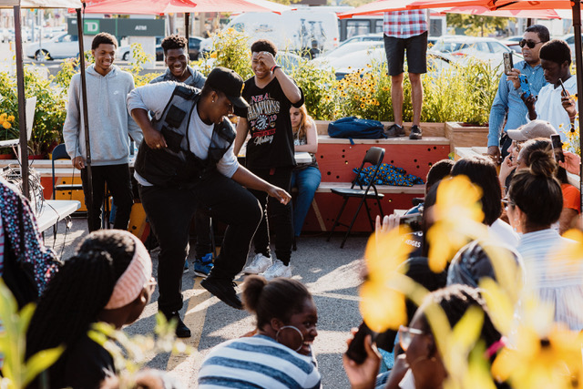
Twelve local youth from an after-school program run from the Arab Community Centre of Toronto across the street have been hired as site supervisors, stewarding the site through daily watering, waste management and other set-up tasks.

At night, LED lighting within the benches creates a welcoming atmosphere, and the illuminated strip mall signage creates a dynamic backdrop. During several evenings this summer, including an upcoming event on August 17th, the WexPOPS stage (with a mural designed by Echo Railton and painted by community volunteers) offers music and dance performances by local artists, co-curated by Scarborough Arts as well as urban ecology workshops lead by the TRCA.

WexPOPS is meant to be a hub of social activity for the local community, but also to attract visitors from beyond — a desire articulated by our working group, whose members wanted to `put Wexford on the map.’ The space features a neighbourhood business directory which encourages people to patronize the local restaurants and businesses (and eat takeout in the space), as well as a ‘dot map,’ which prompts visitors to place a sticker on a map showing where they live. This data will help the team evaluate the impact and reach of the project. The signs were donated in kind by CAS Signs Company, a printer located in Wexford Plaza a few stores down from WexPOPS. The ‘Wexford Wish Tree,’ inspired by the shape of the sumac and CNC milled by local AC Waterjet, poses a different question every two weeks and invites visitors to write their answers on a horticultural tag and tie them to the tree for others to read.

WexPOPS may be popping down after August 18, but the proof of concept has already inspired many to reconsider the potential of privately-owned strip mall parking lots as community gathering places, including, perhaps most importantly, the Kirakou family — the property owners and our project hosts. To more concretely determine the project’s impact, the plazaPOPS team is conducting a public life study, modeled on methodologies pioneered by Denmark’s Gehl Architects. We are also studying the impact on parking and local business activity. The Rotman students, guided by Prof. Rafael Gomez, prepared a background study that informed the research design.

Project findings will be published later this year in an exit report, but already, many working in the urban design, community arts, and economic development sectors have noted the potential for applying the plazaPOPS concept beyond Wexford Heights, understanding the value of creating space to support the social life of communities in strip malls across Toronto, Ontario, and Canada.

photos courtesy of Rotsztain and Stewart


More information about the project and its design and planning process are available at www.plazaPOPS.ca and via twitter and Instagram at @plaza_pops. You can reach the team at plazapops@gmail.com.

IMG_8582.JPGWith all the euphoria that spring day, it was hard to choose the perfect spot to watch the Raptors victory parade.

Everywhere along the route, unprecedented crowds gathered along Toronto’s downtown streets to witness the spectacle of a winning team celebrating their victory for Toronto — a city where it feels like no one ever wins.

You could have joined the crowds gathering at Nathan Phillips Square – already thick by mid-morning. You could have huddled with the spectators along both sides of University Avenue, where finally, our boulevard of grand, celebratory proportions would be used to host a jubilant mass of joyful Torontonians.

IMG_8615.JPG

IMG_8578.JPG
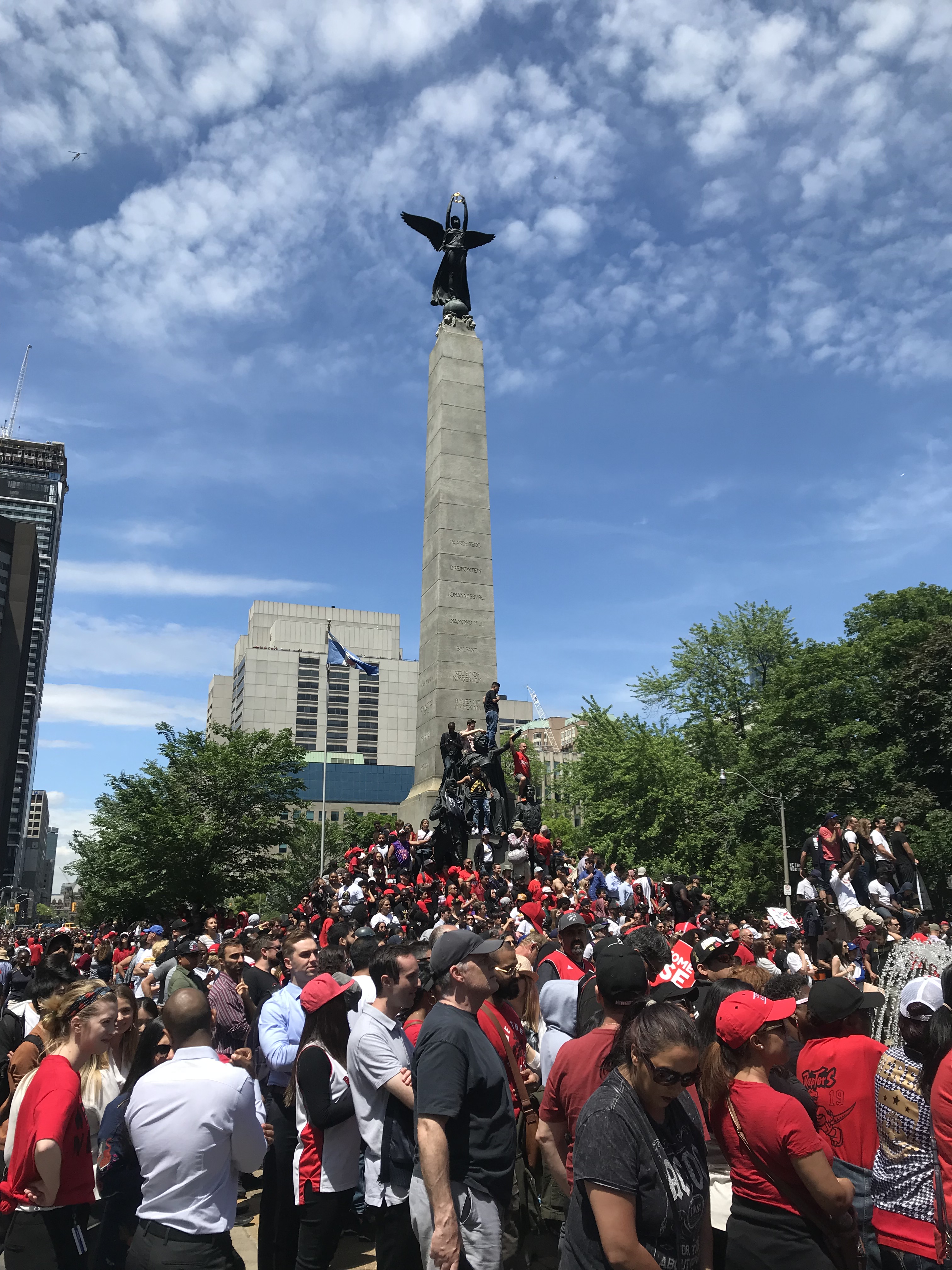
But the best part of the Raptors winning the NBA championship was that it had nothing to do with nostalgia. The multicultural and decentralized fanbase crystallized the identity of today’s Toronto, representing a final departure from the hockey sticks, maple syrup, whiteness and wilderness of Canada’s imagined identity. It firmly asserted the existence of what actually defines our lives in Canada, a country of immigrants, where soccer, cricket and basketball are quickly superseding hockey, and where 80% of the population lives not in pristine nature, but the suburbs.

With its decentralized fanbase, the Raptors championship helped assert the public identity of the more suburban corners of the GTA. In parts of GTA we don’t associate with public life – like Brampton, Ajax, and Mississauga – central squares filled up for a communal experience and face to face interactions. With every victory, impromptu parties in strip mall parking lots were stirred up by cars’ celebratory honks as they zoomed along the 6-lane arterials of the inner suburbs.

Though the parade route was planned for downtown Toronto, it would have made just as much sense if it were up Hurontario and into Celebration Square in Mississauga, or along the 401, through Albert Campbell Square, and up the steps into Scarborough Town Centre.

And so, the best place to watch the Raptors parade was not in Nathan Phillips Square or University Avenue, beside the institutional symbols of old Toronto, but down by York and Harbour Streets, nestled between the shiny new condo towers in SouthCore, a neighbourhood that most clearly symbolizes the Toronto of 2019.

IMG_8444.JPG

IMG_8469.JPG
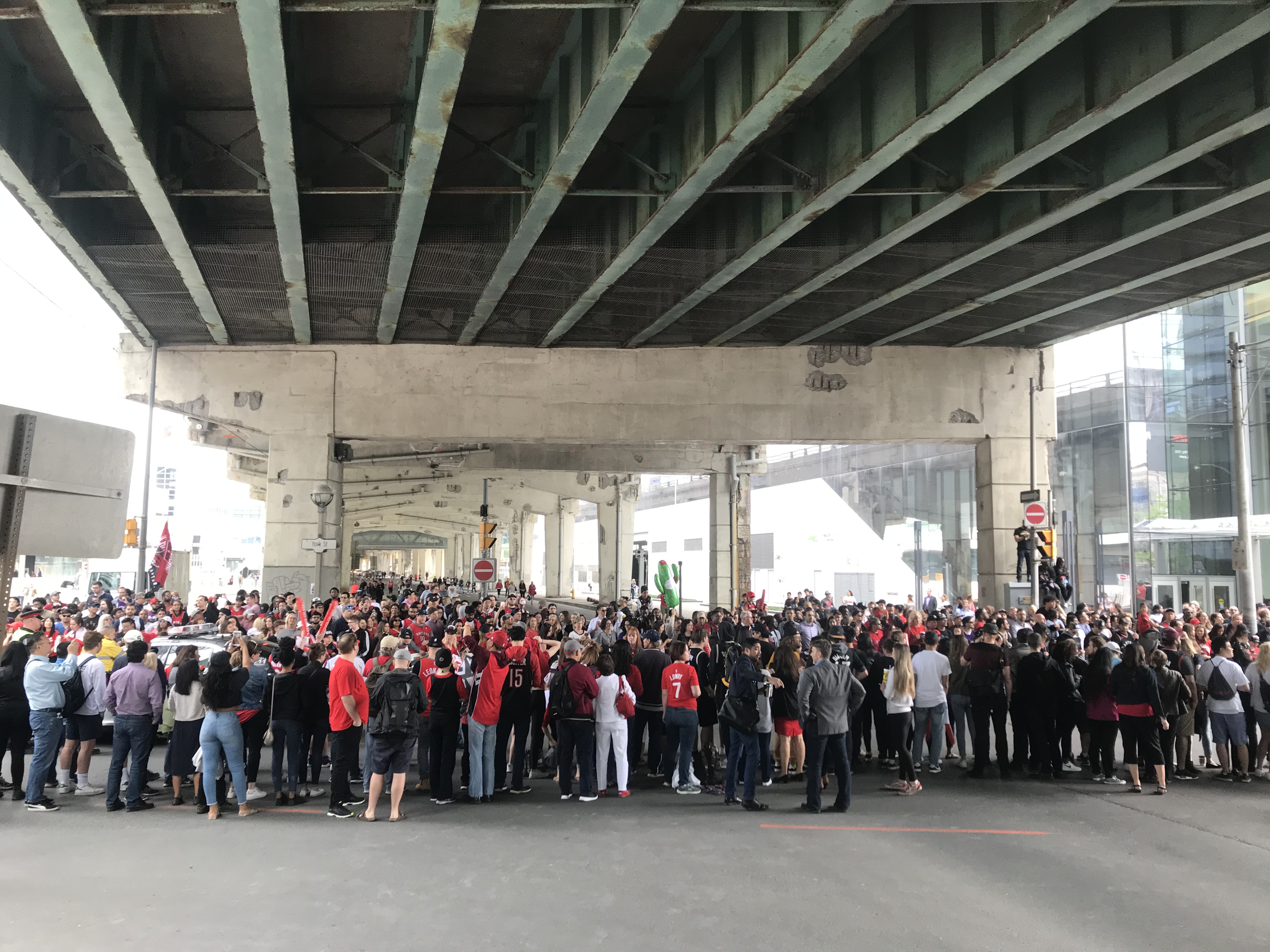
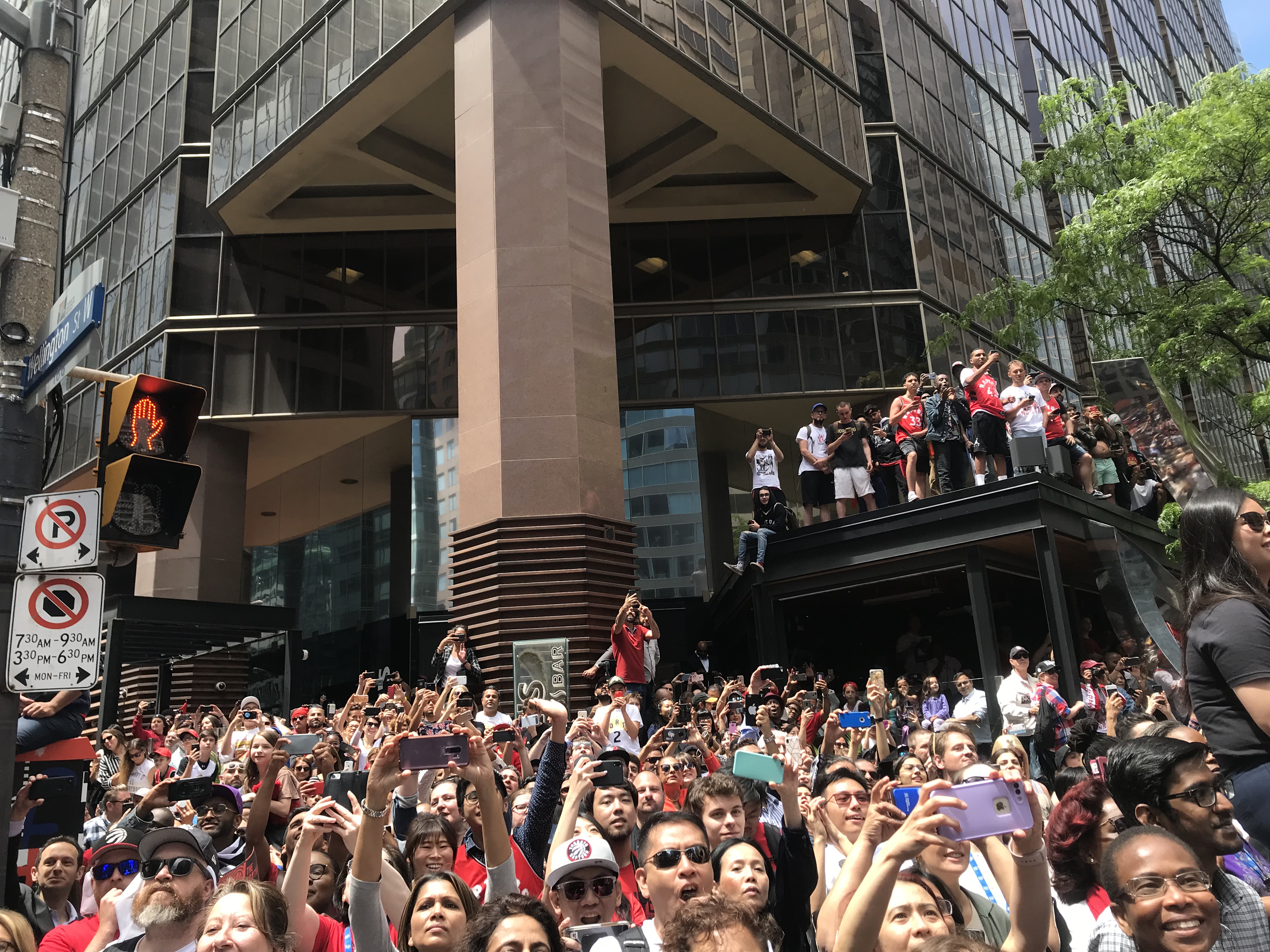
As crowds gathered under the Gardiner Expressway, condo balconies slowly fill up with onlookers, new vantage points of a city recently verticalized. From the many uncompleted condos, construction crews watched from scaffolding high in the sky – our very own Lunch atop a Skyscraper. As we waited… and waited, and waited… cheers echoed from under the highway and against the condo glass, a kind of welcoming embrace for these new icons of Toronto’s skyline.

IMG_8562.JPG
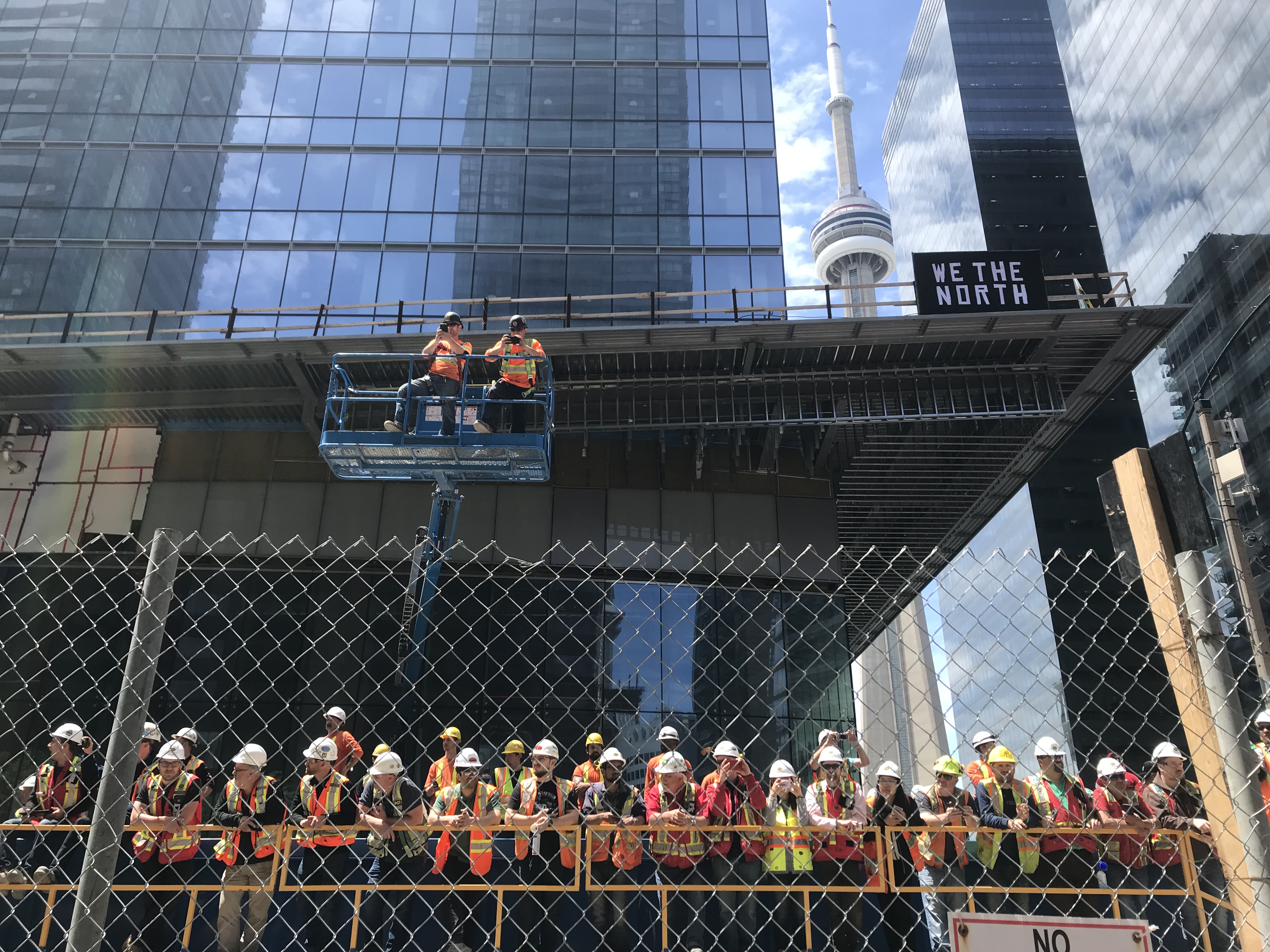
One of the best parts of the Raptors playoff run was how it transformed Torontonians relationship to public space, even before the parade. While the Raptors got ever closer to the championship, the sidewalks became extensions of the bars where massive crowds gathered to watch the games together.

IMG_8436

IMG_8569.JPG
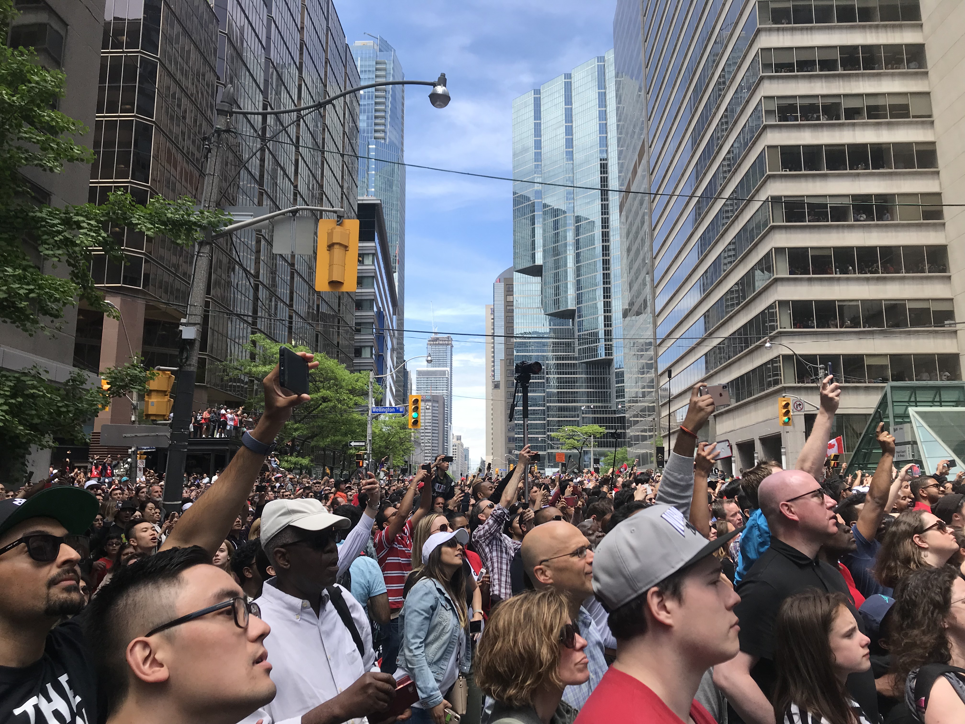
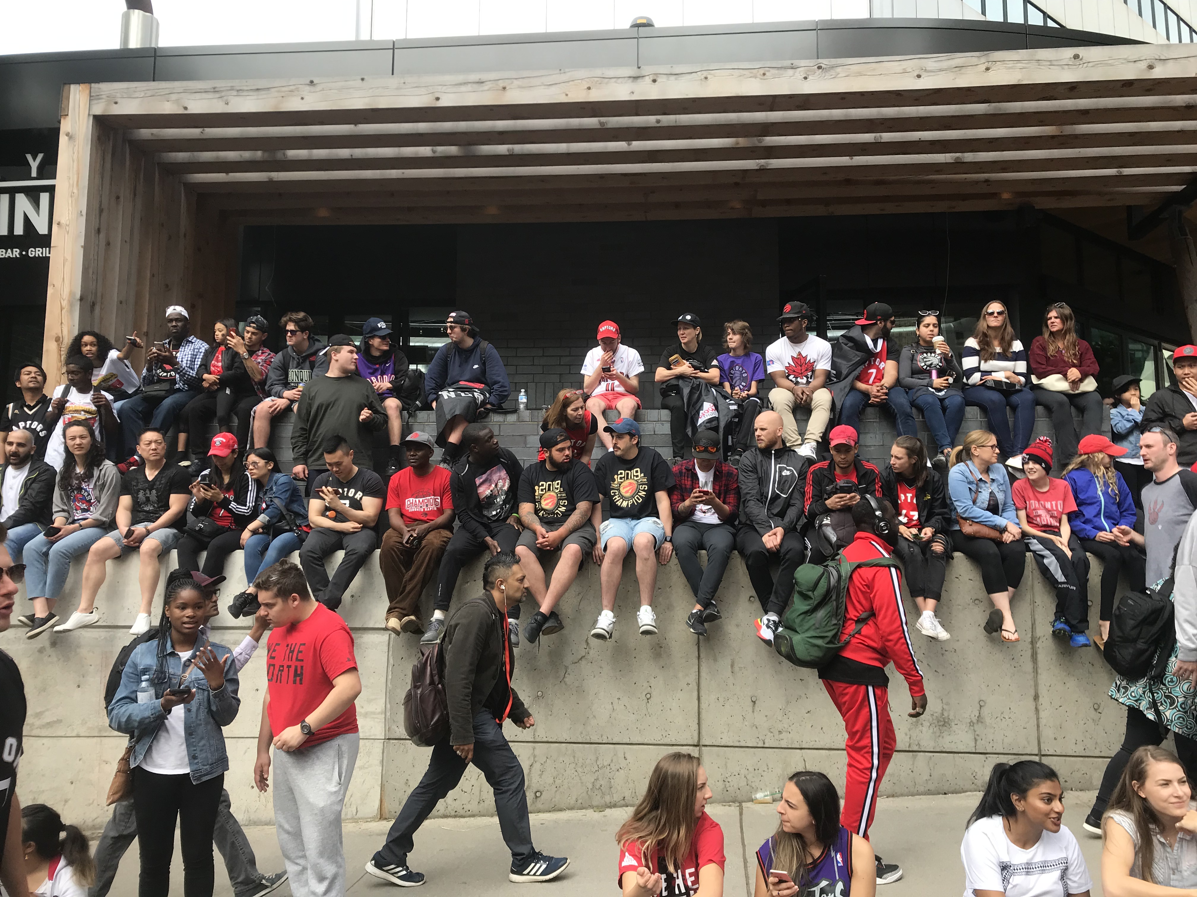
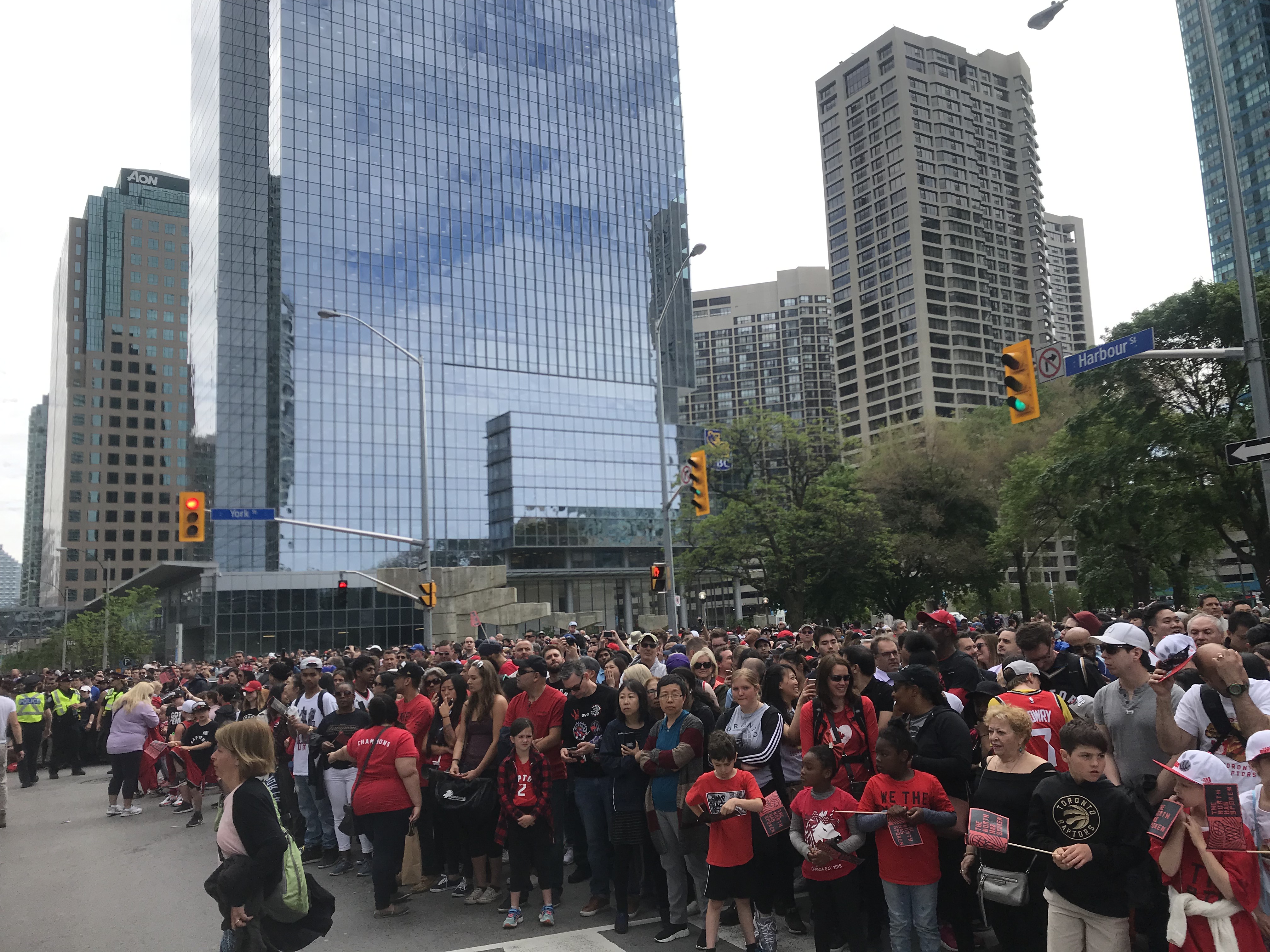
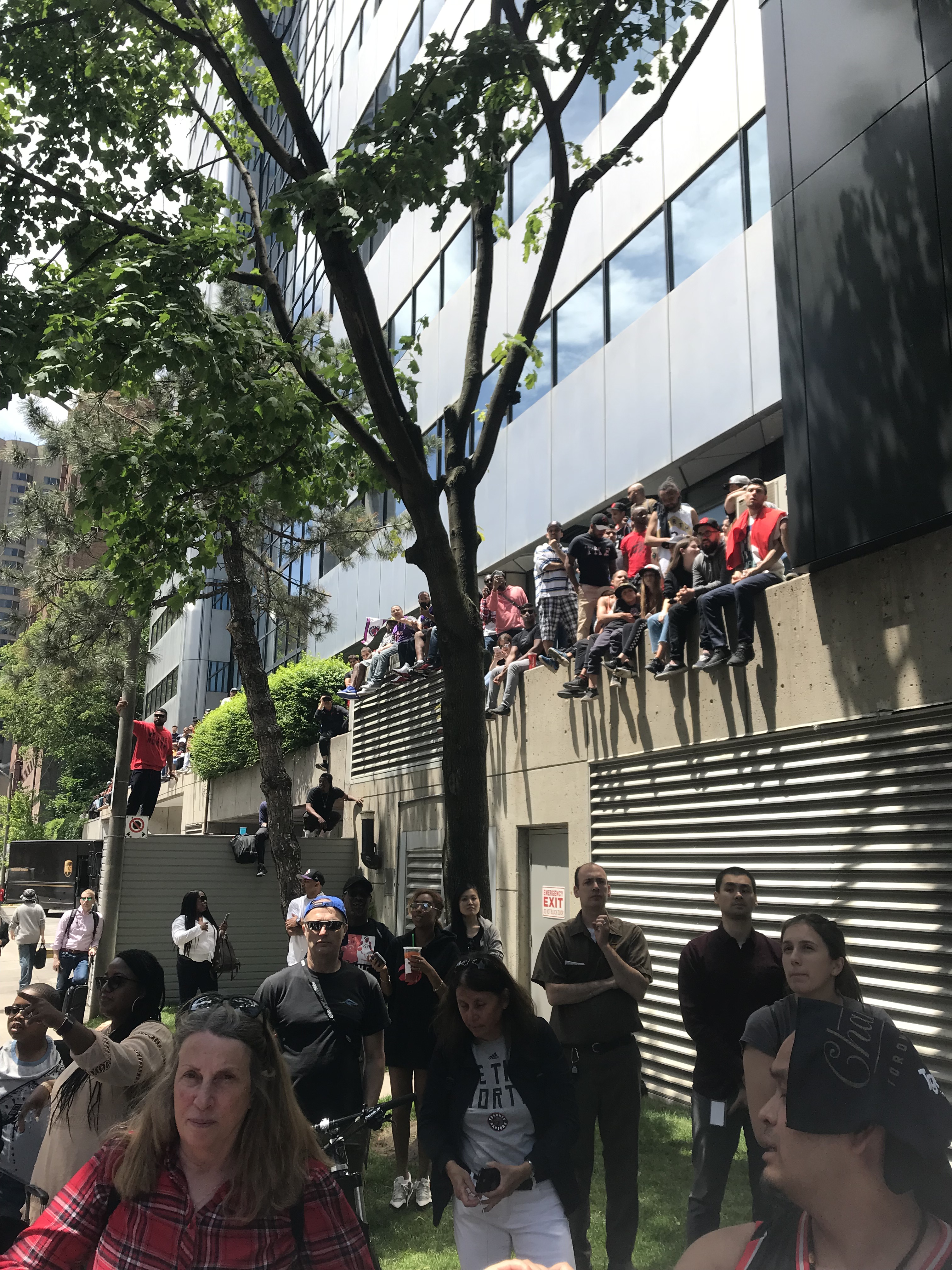
During the parade, typically mild-mannered Torontonians climbed every climbable thing — bus shelters, street polls, scaffolding. Every accessible surface, grass patch and ledge were claimed as public space and filled with eager onlookers. Anonymous spaces became bona fide places: families with young children gravitated to the parking garages by York and Harbour Streets where kids’ sidewalk-chalk covered the highway-like thoroughfare usually hostile to any sort of lingering, let alone play. Banal skyscrapers lining the streets of the Financial District came to life as their occupants pressed against glass windows on every floor to take in the view of the streets filling with revellers.

IMG_8457.JPG
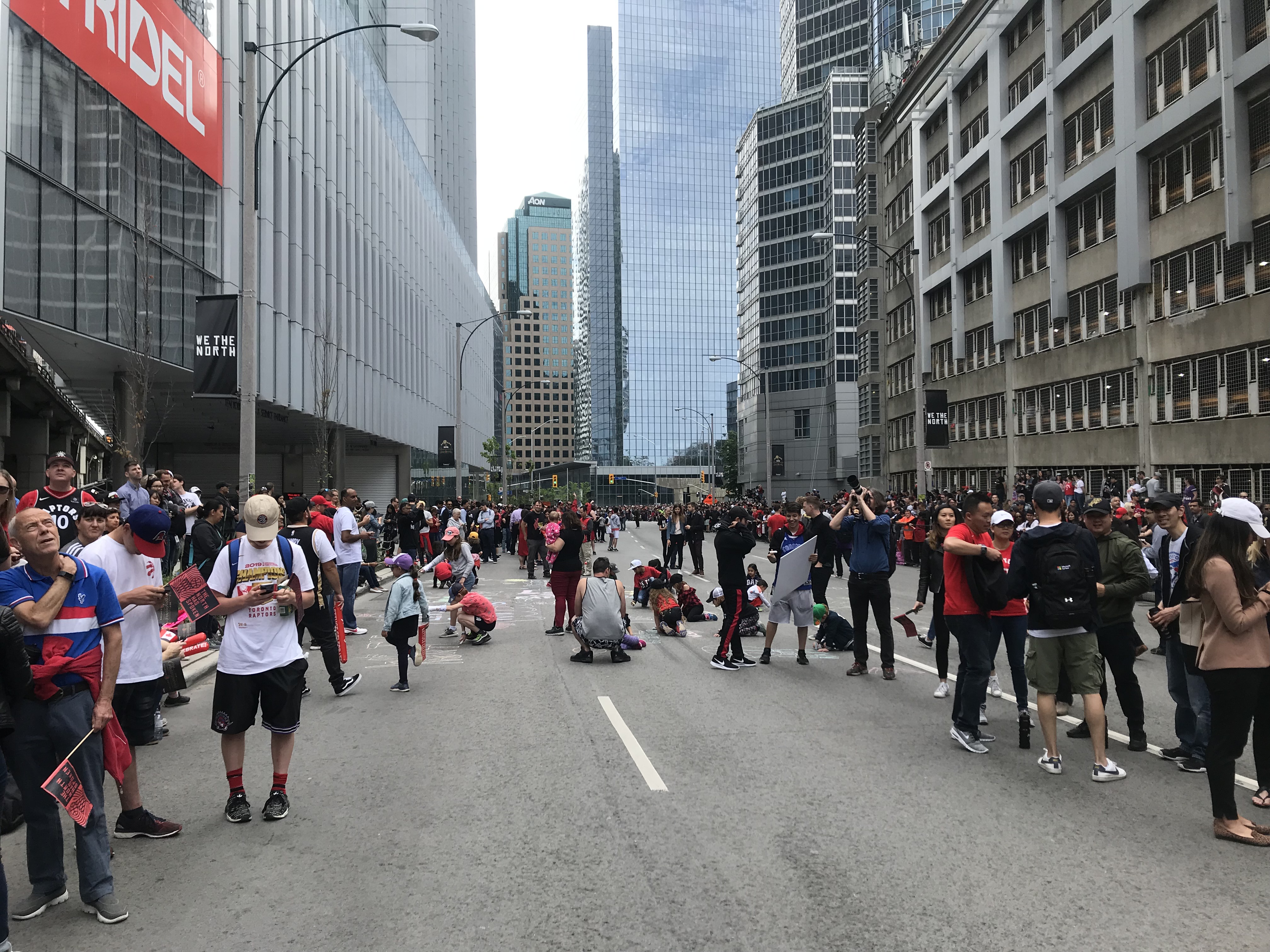
While I wish so many people would turn out for something that mattered a bit more — a fraction of the people turned up for the climate marches in September — there were indeed political undertones to the day, most notably, the booing of Premier Ford from the GTA crowds who should be his main constituents, bringing politics and sports together in ways it usually resists.

We learnt a lot about ourselves during the Raptors’ 2019 championship run. As the team gets ready to open the 2019/2020 season, the hype now gracing the them will ensure that Toronto’s identity will continue to embrace to the farthest reaches of the region. And after climbing so many bus shelters and ledges, sidewalk chalking roads, and sharing space in jubilation, I hope that Torontonians continue to be emboldened to take joy in occupying our public spaces in everyday life, for sports, and for protests about the things that matter most.

Actually A Sea image.jpg

If you follow me on twitter or instagram you’ll already know about my social media campaign #actuallyasea

Basically, we call Lake Ontario a lake, but I think doing so is an injustice to this massive, powerful, majestic body of water. As I’ve written over at Spacing Toronto, Lake Ontario is actually a sea. The way we talk about things says a lot about our relationship to them, and calling a body of water a lake serves to domesticate it, and dominate it.

A lake is something knowable and safe. Calm waters that you dip your feet in at the cottage.

A sea is a more appropriate word for what Lake Ontario is, and by calling it a sea, we can elevate the status of the waters in our minds and understanding Toronto as “a city by the sea”. We often call the Great Lakes, collectively, “inland seas”, but rarely give them the sea treatment individually. My campaign has mostly focused on Toronto because Lake Ontario is the sea I know best, and the campaign has to start somewhere!

Since writing that post on Spacing, the campaign has really taken off. Many friends and strangers have begun to tweet and instagram using the tag, and a growing body of photos and other documentation is charting the potential of understanding Lake Ontario as the Sea of Ontario (or Ontario Sea, if that floats your boat).

Cx-1Gz3XUAE5A7a.jpg

An example of Instagram posts tagged #actuallyasea. Thank you to @theholygasp, @lindsayzv, @sammytangir, @am__eh and @studiojaywall for your contributions!

I’ve also been gathering more evidence to make the case that Lake Ontario is #actuallyasea, and am excited to provide an update on the campaign:

i. Indigenous perspective

In the original Spacing article, I failed to acknowledge Toronto’s First Nations history and their relationship to these massive bodies of water. As a white-settler geographer, it is my responsibility to recognize and centre First Nations histories, and I apologize for this oversight.

In no way can I speak for the Wendat, Haudenosaunee, or Anishinaabe cultural view points, but many online resources have compiled interpretations of the Great Lakes from a First Nations perspective.

A resource I often use is the Decolonial Atlas. The blog has an entry called The Great Lakes in Ojibwe  that shares the Anishinaabemowin (Ojibwe) names for the Great Lakes, as it “is the most-spoken indigenous language in the Great Lakes basin.”

The Great Lakes are known as Nayaano-nibimaang Gichigamiin, or, the Five Freshwater Seas. Lake Ontario is known in Anishinaabemowin as Niigaani-gichigami, or the Leading Sea.

I have also heard Gichigami translated as “big water”, “large sweet water”, but what matters is the languages’ distinction between bigger and smaller bodies of water.

Of course, there are many, many cultures and nations today and historically that lived in the Toronto and Great Lakes region, and Anishinaabemowin does not represent all these perspectives. I am striving to understand more about Toronto’s First Nations history and support (not co-opt) the voices of others, so please let me know if I have made any mistakes or oversights.

ii. The Caspian “Sea”

Screen Shot 2017-01-27 at 6.58.50 PM.png

One of the most contentious parts of the #actuallyasea campaign is that people can’t accept that there is no technical definition of a sea. As I mention in the post, the term sea is more cultural than scientific, and there is no hard and fast definition of lake vs sea. Despite that, most people are inclined to say “Lakes are freshwater, seas are salt water”, and dismiss the entire campaign as fanciful whimsy.

In the Spacing article, I cite the Sea of Galillee as the primary definition-jammer. Known as a sea, it’s technically a lake, and is a fraction of the size of Lake Ontario. Its sea-status makes this biblical body of water worthy of its myth and power.

I always knew that the Caspian Sea was also a potential definition-jammer, but I only recently confirmed that the large body of water between Europe and Asia is (according to Wikipedia) “variously classed” as the “world’s largest lake” of a “full fledged sea”. The Caspian Lake is #actuallyasea as much as the Great Lakes are! Though its salt water, it is a distinct body of water separate from the ocean, and thus could be interpreted as a lake. How confusing! Exactly! According to the fantastic instagram account, AMapADay, “the ancient inhabitants of its coast perceived the Caspian Sea as an ocean, probably because of its saltiness and large size”.

If Lake Caspian is #actuallyasea, and has been known as such for millennia, well then, it’s about time we call Lake Ontario the Sea of Ontario.

iii. The Swedish sjö

One of the things that really jumpstarted the #actuallyasea campaign was when I was showing a friend from Sweden around Toronto, and she kept referring to Lake Ontario as a sea. As I write in the Spacing article, “In Swedish, sjö refers to both lakes and seas, so she wasn’t technically wrong”.

As you may know, I’m currently living in Malmö, Sweden for the next five months – and it was only a matter of time I confirmed this confusion of terms.

Screen Shot 2017-01-27 at 7.04.30 PM.png

Vänern and Vättern, the Swedish sjös, and the Baltic Sea to the east

And yes, sjö does refer to both lakes and seas. Specifically, it refers to the two large bodies of water in southern Sweden surrounded by land, but is also the term used to describe the Baltic Sea. (It also turns out that sjö is pronounced completely differently than I had initially thought. Instead of syo, it’s more like hweh – how bout that.)

For some context, Vänern, one of the Swedish sjös is 5650 square kilomtres, and Lake Ontario is 19000 square kilomtres. Lake Ontario is most definitely #ActuallyaSjö

___

Those are the updates for now – in the mean time, check back on the campaign as it continues to grow on social media, and contribute your own photos of how Lake Ontario is a sea by tagging #actuallyasea!

Cx-1Gz3XUAE5A7a.jpg

malmo

I’m from Toronto – Grid City. I like a good orthogonal city plan. A city where North is up, South is down, and East and West, are, you guessed it, side to side.

Well, Toronto is not exactly a perfect grid. As Dylan Reid has explored on Spacing, Toronto is in fact a series of micro grids, stitched together, with some exceptions for topography that even the imperially-decreed gridded city plan couldn’t ignore. But that’s a fine detail, a technicality. The macro grid – the one that made up of Toronto’s major streets –  is based on a series of 2km-spaced concession lines, and it defines how the city is organized.

Growing up in Toronto, City of Grids, I think, is part of why I have such a keen sense of direction. People in Toronto, they use cardinal directions to direct people where they need to go. “Go north on Bathurst, then west on Eglinton” they’ll say, and it makes perfect sense. As a result, I have North permanently etched into my mind as essential to understand where I am.

Even when a city’s grid doesn’t match the cardinal directions, a perfect grid means that people use cardinal directions anyway. In Montreal, what people call North is in fact more North-West. In Guelph too. Rather than constantly say “go north-west, then south-west”, people have collectively adjusted the meaning of north in the local context.

Other cities – where the grids aren’t so reliable – aren’t like this. In Halifax, an otherwise perfect grid bends around the Citadel and Common. The grid dissolves into spaghetti as the straight elements (the roads), navigate rounded elements (the Common). As a result, people are more inclined to say “Go up Robie”, “Go down Agricola”, instead of cardinal orientation, and it just makes more sense.

halifax

In Newfoundland, at least, according to my friends, directions are much more story-based than cardinal- based.  St. John’s is pretty loopy city, and the small downtown grid quickly dissolves to negotiate the city’s various hills and steep slopes. Here, instead of “Going north on Prescott Street”, directions are more based on stories, and landmarks. “Go past Rosie’s Convenience, and make a left”.

st-johns

As you may know, I am currently living in Malmö, Sweden, and will be exploring the Skåne region for the next five months.

Malmö is especially disorienting to me because, as this post’s title suggests, the city is almost a grid, but, it’s not quite a grid. Two streets that I think are parallel end up veering away from each other, and intersecting at other points, as the map below highlights.

malmo2

I’ve explored how different cities present different flavours of disorientation, and as kinds of disorientation go, this might be the toughest challenge so far. I’m so sure I know where I am, using my Toronto infused griddy-knowledge, only to be constantly lost, and going in the wrong direction. In almost making sense as a grid, but then not being a grid at all,  it has been a humbling, getting lost experience (and this is a good thing).

This posts title was inspired by The Almost Nearly Perfect Peoplea less than perfect exploration of Scandinavian culture by Michael Booth. 

giphy.gif

Ever since I moved to the island in the winter of 2014, I’ve been fascinated with its shifting and changing, a symbol of the instability of even physical geography. Originally a sand bar created from deposits of sediment at the Scarborough Bluffs and Don River, it initially changed shape with every season and storm, until it was infilled in the 1930s to its currently fixed form.

But Gibraltar Point, as I’ve explored on this blog and in my first post on Spacing Toronto, is the last bit of wild, shifting island. And it is eroding fast. The above GIF is a thirty year period, and if you look closely at the Island’s southwest, you can see the land slowly receding.

I wrote about the current situation in the Globe and Mail, and had the chance to speak with several island characters including Jimmy Jones who grew up on the Island when it was fully inhabited, Warren Hoselton, the head of Parks and Recreation for the Island, long-time visitor artist Shoshanah McKay, and Ethan Griesbach, a project manager with Toronto Region Conservation Authority. Read it here.

_DSC8969.jpg

In late October, Glo’erm and I put up a fake development proposal sign on the lawn of Old City Hall in Toronto. The proposal included a 90-storey residential tower, while the heritage building would be converted into a parking garage. At the bottom of the sign was a link to a website that featured several other, increasingly absurd, parody proposals.

DP_Old City Hall2.jpg

I guess pranking is still in style, because the stunt was covered by every local news outlet in Toronto, with many thinking it was real. The project struck a chord with a city anxious about how fast it is changing.

Screen Shot 2016-10-25 at 9.22.12 AM.png

Some of the comments on CityTV’s coverage of the story, ranging from outrage to… outrage

After articles in blogTO, the Toronto Star, Metro Toronto, and Canadian Art, and some hilarious TV news coverage where they created animations of the proposed buildings actually coming out of the existing structures,  I wrote about our motivations in the Globe and Mail. (We were initially anonymous, but decided to reveal ourselves to explain the ideas behind the project and keep the conversation going, not to mention some good press).

Screen Shot 2017-01-13 at 1.51.15 PM.png

The signs in the print edition of the Globe and Mail, October 29, 2016

As soon as the article was published, there was a vast amount of criticism regarding my position. One critic called it “NIMBYism dressed up as art”, despite my very clear stance that development is needed, but that doesn’t mean it has to be so extreme and uncontrolled. I do agree with most of the critiques, and my knowledge about the state of development in Toronto has expanded greatly from this experience.

tumblr_inline_ofzjmn4BtX1r97ndl_540.jpg

Basically, the reason we’re getting so much “hyper-density” in Toronto, is because of what is known as the Yellow Belt – huge swaths of Toronto zoned as Neighbourhoods, and protected from development that doesn’t meet the character of the area. This means that people can use the official plan to reject even gentle, mid-rise density from these neighbourhoods. With a rapidly growing population in Toronto, that density has to go somewhere – and its landing in neighbourhoods where there weren’t many previous residents to defend them, like along lower Yonge Street and Liberty Village. One planner described it as a stress ball: if you squeeze the ball, all the pressure has to go somewhere, and it’s popping up as a extremely high density in certain parts of the city.

I was able to express a more nuanced view in an interview with NOW magazine.

Inclusivity is important: Toronto has an affordable housing crisis, and its important to increase the supply of housing so that the city remains accessible to all. The development proposals we are critiquing are not the answer: they are not affordable, and their extreme heights do not contribute to a higher quality of life.

I stand by our initial critique of an opaque proposal process that leaves most Torontonians out of the decision making process. When you go to a public meeting regarding a development proposal, that meeting is only accessible to a certain segment of the population, who have the time and knowledge to be able to respond to a fully formed proposal that will probably be built. At those meetings, as critical urbanist Jay Pitter has said more than once, the most important question is who is not at those meetings, and why aren’t they there?

This post originally appeared on Spacing Toronto

Plan of York Surveyed and Drawn by Lieut. Phillpotts, Royal Engineers. Map courtesy Library and Archives Canada and accessed from http://oldtorontomaps.blogspot.ca/

While gazing over old maps of Toronto, I often long to experience the city before its landscape was so significantly altered. What was it like when the water went right up to Front Street, before infill extended the shoreline by almost a kilometre? How did the Lower Don River feel when it meandered into a vast marshland at its mouth, before it was straightened and channelized?

That’s why I was so excited to visit Long Point last week. A sandy peninsula protruding into Lake Erie, Long Point feels like going back in time to an earlier version of Toronto Island — when it was a wild, sandy and ever-changing spit still connected to the mainland.

img_4626

As Lake Erie shares Lake Ontario’s crumbly shoreline, Long Point is the result of almost the same geologic phenomenon that created Toronto Island — eroded sediment swept by the currents of the lake to create a sandy peninsula and protected bay. The most notable difference is size. While Toronto Island was originally a 9km spit, Long Point is about 40 km.

Unlike Toronto Island after 1858, Long Point is still connected to the mainland. It briefly enjoyed island status after a powerful storm in the 19th century severed a channel through its middle, but was reconnected when sediment washed back to fill the gap. The same would have probably happened in Toronto if there weren’t so much interest in maintaining the Eastern Gap, giving ships easy access to Toronto’s deep harbour and the markets beyond.

Long Point on Lake Erie. Image courtesy of canmaps.com

Beyond its tentative connection to the mainland, Long Point’s form has not been significantly altered by human activity. Whereas Toronto Island was largely fixed by depression era infill projects transforming its ever-changing fingers of sand and marsh into the archipelago of islands we know today, Long Point has maintained its fluid form as a constantly shifting (and hard to map) sand bar.

Compared to the few patches of forest along Toronto Island, Long Point is a vast wilderness. Designated a World Biosphere Reserve by UNESCO, most of the peninsula is conserved explicitly by the Federal Government and Parks Ontario, and inadvertently by the Long Point Company, a private organization that has maintained the spit for hunting purposes since 1866, strictly limiting public access.

Walking along Long Point’s sandy beaches, you don’t even have to squint your eyes to imagine the feeling of Toronto before it was urbanized. An overgrown Carolinian forest hugs its sandy shore, and beyond the bay, where in Toronto a hulking skyline has emerged, there remains open water, marshland and sky. Port Rowan, tucked into the corner where Long Point meets the mainland has a population of about 1000 – the size of the similarly positioned town of York around 1812.

Long Point marshes. Image courtesy of Wikimedia Commons.

Toronto Bay, 1793 by Elizabeth Simcoe

Long Point boasts its own community stretching the first few kilometres of the peninsula, offering a living image of another era of Toronto Island’s history: when it was covered in cottages and fully serviced by hotels, grocery stores, laundromats and restaurants. Like Centre Island before its town centre was demolished by Metro Toronto in the 1950s and 60s, Long Point’s year round population of 450 swells to 5,000 in the summer.

cottage

Many of the cottages that dot the peninsula are reminiscent of the homes that used to cover the Island and those that were saved at Ward’s and Algonquin Islands. Built right up to the beach, their plain geometry bespeaks the simple pleasures of living lakeside, where all you need is a place to rest your head before heading back to the beach. A few grander cottages evoke the summer homes of the wealthy that were built along Toronto Island’s Lakeshore Avenue.

Despite never having been to Long Point before last week, the feeling of familiarity and connection to Toronto Island was uncanny. Of course, Long Point and Toronto Island are distinct places with their own histories, and comparing them requires a a stretch of geographic imagination. However, a visit to the largely preserved landscape at Long Point offers a portal into the past, its equivalent in Toronto having been changed beyond recognition long ago.

My article exploring the decline (and reinvention) of Toronto’s convenience stores appeared in the May 21 edition of the Globe and Mail.

Because there’s no link to it, here’s a copy of the article downloaded from the newspaper’s digital-print edition.

13248470_10206086684720295_5554025669826444697_o.jpg

The article also beckoned my first letter to the editor! Happy they went easy on me, and interesting to hear convenience stores experienced decline much earlier than I thought. In a city, the only constant is change.

Letter to editor.png


Cities of.png

As my last post explored, Southern Ontario’s physical geography is often ignored, and its landscape is often derided as being flat, monotonous and boring.

Disconnected to the subtle features of the landscape by 400-series superhighways, big box plazas and its relentless grid, its understandable that the infinite beauty of the land beneath the concrete would be, for the most part, forgotten.

Beyond the highways, Southern Ontario’s rich glacial soil has been sculpted into dramatic river valleys, cuestas, waterfalls and the rolling hills of drumlin fields by millennia of water movement.

My map (leading image) is an effort to re-assert the geologic features most prominent in these three very connected cities at the western end of Lake Ontario. Happy exploring!

Originally posted on Spacing Toronto

Facing each other across Spadina Avenue just north of Adelaide, the Tower and Balfour Buildings frame a striking entryway into Toronto’s Fashion District.

Previously known as the Garment District, the neighbourhood was home to many of Toronto’s textile workers, who were predominantly Jewish immigrants.

Masterpieces of Art Deco architecture, the Balfour and Tower buildings were originally built to house those garment businesses and their showrooms, raising the prominence of the industry, and the city with it.

Designed by Benjamin Brown in the late 1920s, their towering elegance was symbolic of Toronto’s transformation into a modern metropolis — a financial, cultural and transportation hub with a swelling population over 200 000.

That elegance extended to several other Brown-designed buildings nearby including The Commodore on Adelaide, The New Textile Building on Richmond (now an OCADU building) and the Hermant Building at Yonge and Dundas Square.

Despite defining the city at a critical point in its history, Benjamin Brown has remained relatively unknown.

At a time when people weren’t interested in Toronto’s architectural history, let alone the work of a single architect, Brown’s entire collection of drawings were forgotten about in the architect’s garage and left to deteriorate.

When Brown died, he left the collection to fellow architect Jim Levine, one of the only people who recognized the value of the work.

The Ontario Jewish Archives took over the collection in the 80s and has painstakingly restored it, ensuring that a valuable archive of drawings that document the emerging modernity of Toronto was not lost. Highlights of the collection are now on view in an exhibit of Benjamin Brown’s work at the Urbanspace Gallery on the ground floor of 401 Richmond, until April 23.

Screen-Shot-2016-02-16-at-4.51.04-PM

The exhibit is an opportunity to get an up-close view of Benjamin Brown’s expertly executed hand-drawn plans and renderings. Brown was a master of lines. His incredibly detailed drawings even include the buildings’ ornamental windows and decorative stonework.

Brown’s drawings are also poignant portraits of Toronto in the 1920s and 30s, where the aerodynamic shapes and sleek lines of Art Deco and Art Moderne dominated architecture and fashion. In the rendering of the Tower Building, Spadina is bustling with crowds in stylish coats as streamline automobiles motor by.

IMG_9392-768x1042

Brown was one of the first Jewish architects to build and sustain a successful practice in Toronto despite the discrimination within the city in the early 1900s. As a result, he was the architect of many spaces for the Jewish community, including Beth Jacob Synagogue (today, a Russian Orthodox Church) and the Primrose Club on Willcocks, a social club for Jewish men (today, it’s the University of Toronto’s faculty club).

As an artist and urban geographer, I was delighted to participate in the exhibit by illustrating many of Brown’s best known buildings, tracing over his lines and creating a map showing the geographic expansiveness of his life’s work. Indeed, Benjamin Brown has hundreds of commissions spread throughout the city.

CommMy illustration of the Commodore Building on Adelaide. Unlike Benjamin Brown, I didn’t use a ruler!

Looking at Toronto through the lens of a single architect is an opportunity to make connections between the city’s disparate neighbourhoods and styles. Benjamin Brown’s designs range from the Art Deco towers downtown to utilitarian garages in the west end, storefronts on Bloor and Georgian, Tudor and Colonial Revival houses in midtown.

Through the work of Benjamin Brown, an intelligible thread runs through Toronto, a city indebted to the grandeur he helped established at the turn of the twentieth century.

See the exhibit of Benjamin Brown’s work at the Urbanspace Gallery on the ground floor of 401 Richmond, now until April 23.