Archives for category: city-art

This reflection is cross-posted on the SLU Urban Readings group. According to SLU, “Urban Readings connects a small team of chroniclers across the hemisphere with the mission to spot and comment on relevant articles connected to the urban realm in international press. The group of writers consists of academics from various fields intersecting the urban, with insight in current discussions from around the world.” Check out more readings here.

The COVID-19 lockdown hit Toronto like the eye of a hurricane. While the virus was causing chaos for our ill-prepared healthcare system and brought the economy to a precarious standstill, it all felt strangely still on the streets. An eerie calm descended on Toronto as cars evaporated from the city’s typically clogged roads and highways, the sudden lack of motors revving and cars whooshing created a deafening quietness.

Many were quick to see that the empty roads offered an opportunity to create a larger pedestrian realm so people could navigate the city while maintaining safe distances from one another to prevent the spread of COVID-19. After several weeks of advocacy for Toronto to open lanes of traffic to pedestrians, politicians and public health officials remained reluctant to do so, perpetuating a car-oriented logic that defines the planning and management of most North American cities. While cities around the world — including many in Canada — were opening hundreds of kilometres of empty streets to pedestrians, Toronto remained stubborn on the status quo. While advocacy was reaching a fever pitch amongst urbanists online, it had yet to pierce the mainstream discourse.

I am a member of the Toronto Public Space Committee and an organizer of its Art Subcommittee, exploring how we can use art to advance public space advocacy. At a virtual meeting, we realized that our collective effort to create more space for pedestrians in Toronto during COVID-19 and beyond needed something to rally around (and of course, a hash tag.)

Screen Shot 2020-05-19 at 1.58.32 PM

The Social Distance Machine

With the help of artist and musician Bobby Gadda, we created the Social Distance Machine, a giant wearable hoop made out of plastic conduit piping and bicycle inner tubs to clearly demonstrate how large 2m really is — the recommended distance to stay apart to prevent the spread of COVID-19 — and how little space in Toronto is allocated to pedestrians to maintain that distance from others. We wanted to create a video that was humorous and highly shareable, to contribute a lighter tone to a very serious conversation. We released the video the morning of April 13 with #streets4peopleTO and by the end the day it had gone viral around the world, resonating with other cities that were facing similar struggles as they demanded more space for pedestrians to navigate their streets safely.

Toronto’s politicians and public health officials responded slowly. Despite endorsements from major thought leaders and an editorial from the Globe and Mail, the City of Toronto remained reluctant to accept the new reality that people were going to be going outside, and that the city’s infrastructure had to be adapted to facilitate pedestrian movement safely.

We Are Not “All in This Together”

A common phrase we’ve heard during COVID-19 is that “we’re all in this together”. The message is everywhere: posted in shop windows, on social media, in advertisements, and endlessly repeated in politicians’ speeches. The immense gap between those who have the time, space, and resources to safely navigate the pandemic and those that do not demonstrates that this catchy phrase is far from the truth. COVID-19 has emphasized the inequities and issues that existed before the pandemic, rendering them unignorable. As Paul Taylor, the Executive Director of Foodshare, a food security organization in Toronto, wrote in an op-ed to the Toronto Star, “many of the requirements necessary to ensure that we shelter in place are based on the belief that everyone has a smart phone with a generous data plan, ready access to computers and wi-fi, a car, and a credit card”. According to Taylor, the pandemic has most profoundly affected “the millions who were food insecure before the virus hit”.

In terms of urban design, COVID-19 has emphasized pre-existing mobility inequities including the ability to navigate the city safely. In a recent article in Spacing Magazine, Tricia Wood, a professor of Geography at York University writes that “mobility is everything in a city”. According to Wood, “the more freedom of movement you have, the more privilege and advantage you have”. Freedom of movement includes the speed you can get from A to B, access to physical resources and social infrastructure, safe ways of getting around, and safe places to dwell. Before the pandemic, mobility was often limited for those who are disabled, racialized, homeless and queer. COVID-19 has emphasized these pre-existing inequities, while the wider population has begun to understand what restricted mobility feels like.

While the Social Distance Machine went viral and contributed to advocacy for more pedestrian infrastructure during COVID-19, it failed to address the unequal experience of mobility throughout Toronto’s disparate communities and geographies. The Social Distance Machine video demonstrated the inability to navigate Toronto’s central sidewalks safely, but it overlooked what author and placemaker Jay Pitter has termed “forgotten density” in a recent essay in Azure Magazine. Urging us to look beyond the overly studied city centre, forgotten density includes tent cities, suburban social housing, shelters, favelas, temporary foreign worker dormitories, Indigenous reserves, and prisons. Forgotten densities are contrasted to what Pitter calls “dominant density”, which are “designed by and for predominately white, middle-class urban dwellers living in high-priced condominiums within or adjacent to the city’s downtown core.” According to Pitter, these “myopic, privileged framework[s]” of density refuse to distinguish between good density and bad density, failing acknowledge how income, race and disability effect our experiences of urban space.

Within these forgotten densities, residents “are scared to leave their apartments for essential reasons because they can’t practice social distancing in cramped entranceways, elevators and laundry rooms.” Vulnerable populations are at more risk in small apartments without enough space to quarantine, and so-called “front line workers” such as those employed at factories and grocery stores cannot afford to quarantine at home. They are thus more likely to be exposed to COVID-19 than those that have the ability to work from home.

Due to the majority of the population working from home, the Toronto Transit Commission (TTC) has seen a 75% drop in ridership. Sean Marshall, an active transportation advocate and geographer, recently mapped the bus routes that remain crowded during COVID-19 for Spacing Magazine. He found that the bus routes that connect low-income neighbourhoods to factories in Toronto’s northwest remain overly crowded, preventing riders from practicing safe social distancing.

Advocacy for more pedestrian infrastructure requires the equity lens advocated by Wood, Pitter, and Marshall. According to Stefan Novakovic, the online editor of Azure magazine, “progressive urban advocacy means more than wider sidewalks”.

More than Wider Sidewalks

After several weeks of advocacy for more pedestrian space during COVID-19,  the Mayor of Toronto announced on May 6, 2020, that the city would be opening 50km of streets to pedestrians, while fast-tracking the construction of new bicycle lanes. It remains to be seen where and how these pedestrian streets will be implemented. Using an equity lens, advocates need to ensure a geographically equitable distribution of open streets, ensuring relief is given to people most in need of space to navigate safely.

In New York City, more than 100km of streets have been open to pedestrians in response to COVID-19. According to writer Yessenia Funes in Gizmodo, much of those road closures are within and beside existing parks, with wealthier, whiter communities living nearby. As Funes bluntly puts it: “What about the people who don’t live near parks?” Advocates for more pedestrian space in Toronto and beyond need to ask the same questions as their cities pedestrianize roads in response to the pandemic.

Novakovic acknowledges that advocacy for pedestrianizing streets must include communities outside of Toronto’s downtown core. In line with Pitter’s assertion that we must include forgotten densities as we push for conditions for safe physical distancing, Novakovic identifies specific actions, for example the “immediate funding for elevator repair and building maintenance is needed for the city’s chronically underfunded social housing communities”. Toronto’s social housing has $1.6 billion repair back log; we can pivot from the urgency of COVID-19 to address this long-standing issue. As activists, urbanists, architects, and planners call for more pedestrian spaces in the wake of COVID-19, Novakovic urges that “it must be matched by an equally strong push for urbanism at the margins – and creating space for forgotten communities as city builders”. This assertion of equitable urbanism and mobility must be addressed throughout COVID-19 and and in the new post-pandemic world.

COVID-19 may have exposed the inequities that have always existed in our society. However, it also offers an opportunity for meaningful adjustments to our policies and advocacy moving forward. According to Paul Taylor, the pandemic “has given us an opportunity to reflect on what a just and equitable society could look like, one that is measured by how well it takes care of its most disenfranchised members.”

Screen Shot 2020-05-19 at 1.58.24 PM

The Social Distance Machine, a giant wearable hoop made out of plastic conduit piping and bicycle inner tubes to clearly demonstrate how large 2m really is.

Sources:

Funes, Yessenia. “New York City Plan to Close Streets Is Weak As Hell”, in Gizmodo, May 2, 2020

Marshall, Sean. “Mapping TTC Crowding during a Pandemic”, in Spacing Magazine, April 1, 2020

Novakovic, Stefan. “COVID-19: Progressive Urban Advocacy Means More than Wider Sidewalks”, in Azure Magazine, April 25, 2020

Picard, Andre. “It is time for a new mantra: Go outside, but do not congregate”, in the Globe and Mail, May 4, 2020

Pitter, Jay. “Urban Density: Confronting the Distance between Desire and Disparity”, in Azure Magazine, April 17, 2020

Taylor, Paul. “Pandemic has exposed the rifts in our social fabric”, in the Toronto Star, April 21, 2020

Wood, Tricia. “Lessons on urban mobility and inequality during a pandemic”, in Spacing Magazine, May 2, 2020

_DSC8969.jpg

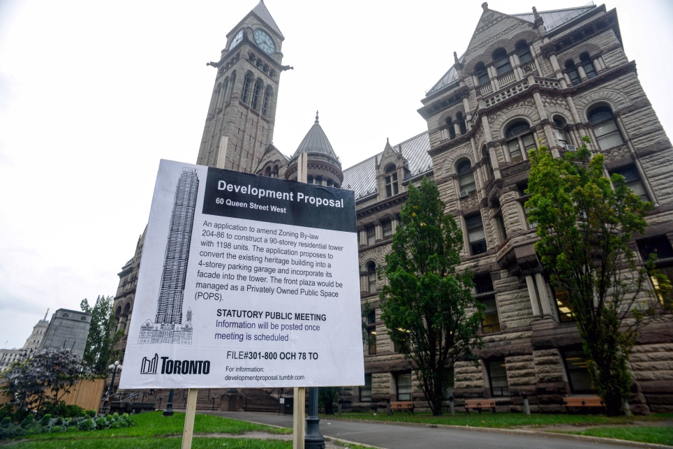
In late October, Glo’erm and I put up a fake development proposal sign on the lawn of Old City Hall in Toronto. The proposal included a 90-storey residential tower, while the heritage building would be converted into a parking garage. At the bottom of the sign was a link to a website that featured several other, increasingly absurd, parody proposals.

DP_Old City Hall2.jpg

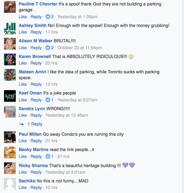
I guess pranking is still in style, because the stunt was covered by every local news outlet in Toronto, with many thinking it was real. The project struck a chord with a city anxious about how fast it is changing.

Screen Shot 2016-10-25 at 9.22.12 AM.png

Some of the comments on CityTV’s coverage of the story, ranging from outrage to… outrage

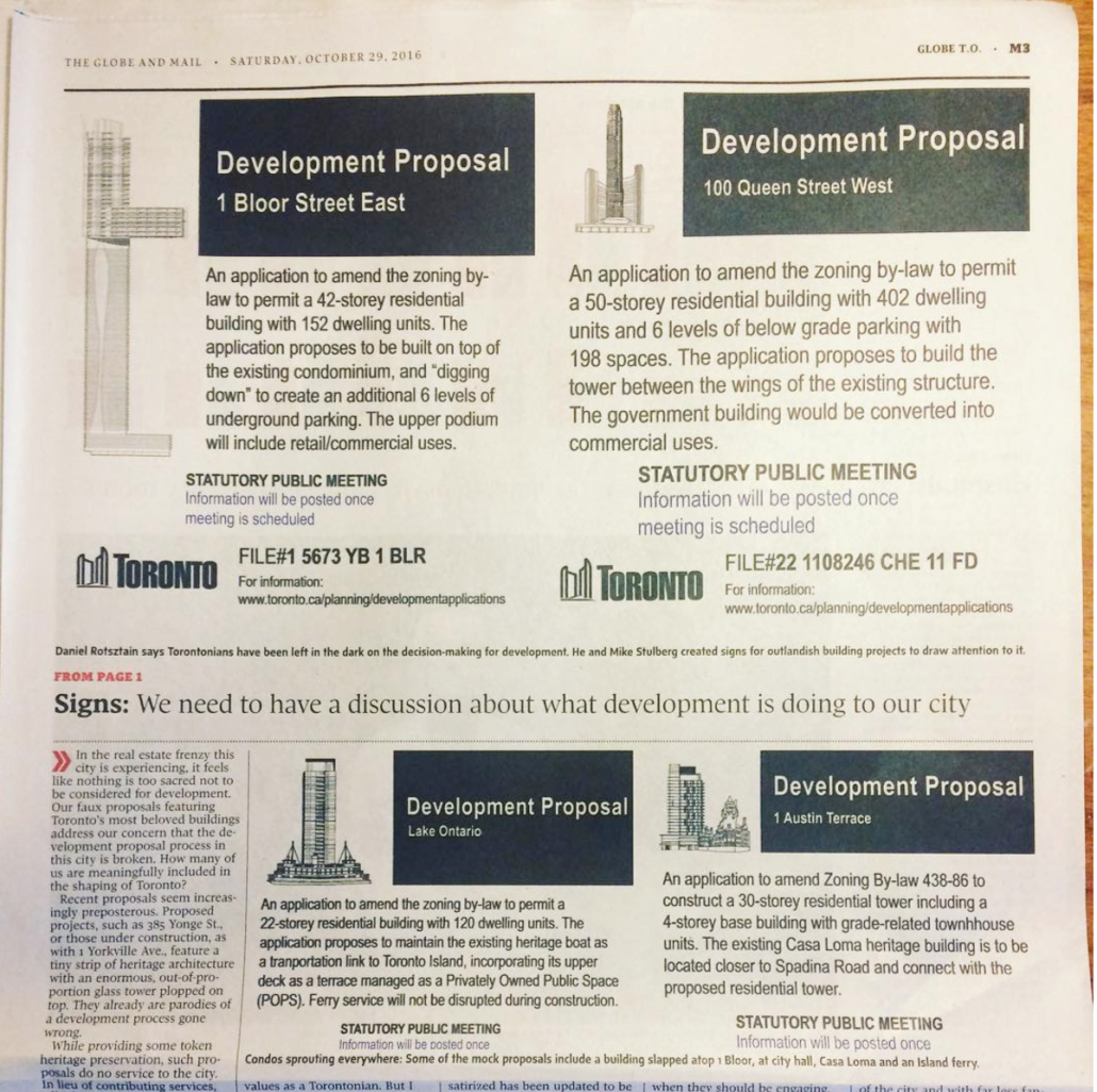
After articles in blogTO, the Toronto Star, Metro Toronto, and Canadian Art, and some hilarious TV news coverage where they created animations of the proposed buildings actually coming out of the existing structures,  I wrote about our motivations in the Globe and Mail. (We were initially anonymous, but decided to reveal ourselves to explain the ideas behind the project and keep the conversation going, not to mention some good press).

Screen Shot 2017-01-13 at 1.51.15 PM.png

The signs in the print edition of the Globe and Mail, October 29, 2016

As soon as the article was published, there was a vast amount of criticism regarding my position. One critic called it “NIMBYism dressed up as art”, despite my very clear stance that development is needed, but that doesn’t mean it has to be so extreme and uncontrolled. I do agree with most of the critiques, and my knowledge about the state of development in Toronto has expanded greatly from this experience.

tumblr_inline_ofzjmn4BtX1r97ndl_540.jpg

Basically, the reason we’re getting so much “hyper-density” in Toronto, is because of what is known as the Yellow Belt – huge swaths of Toronto zoned as Neighbourhoods, and protected from development that doesn’t meet the character of the area. This means that people can use the official plan to reject even gentle, mid-rise density from these neighbourhoods. With a rapidly growing population in Toronto, that density has to go somewhere – and its landing in neighbourhoods where there weren’t many previous residents to defend them, like along lower Yonge Street and Liberty Village. One planner described it as a stress ball: if you squeeze the ball, all the pressure has to go somewhere, and it’s popping up as a extremely high density in certain parts of the city.

I was able to express a more nuanced view in an interview with NOW magazine.

Inclusivity is important: Toronto has an affordable housing crisis, and its important to increase the supply of housing so that the city remains accessible to all. The development proposals we are critiquing are not the answer: they are not affordable, and their extreme heights do not contribute to a higher quality of life.

I stand by our initial critique of an opaque proposal process that leaves most Torontonians out of the decision making process. When you go to a public meeting regarding a development proposal, that meeting is only accessible to a certain segment of the population, who have the time and knowledge to be able to respond to a fully formed proposal that will probably be built. At those meetings, as critical urbanist Jay Pitter has said more than once, the most important question is who is not at those meetings, and why aren’t they there?

Alice Street map

There are, perhaps, no streets more different in Guelph than Alice Street and Woodlawn Road.

On Alice, a jumble of brick houses have been built up to the edge of the street. Before the rise of big box, Alice Street was a hybrid residential-commercial thoroughfare and the heart of the Italian community with general stores and shoe shops in its reconfigured houses. Many of these shops have since turned back into houses, but have been forever distinguished by their past modifications. The effect is an incredibly unique streetscape, like I’ve never seen before, a street of houses with unique DIY renovations, where neighbours hang out on front porches, cars drive slow – the feeling of village and the height of urbanity.

Those aforementioned big box stores – well, they eventually ended up on Woodlawn Road, a street at the northern edge of the city and home to Guelph’s Wal-Mart, Home Depot and various other gigantic corporate retailers.

Woodlawn is a street no one loves but everyone must visit eventually. When I first moved to Guelph, I ended up there countless times, dreading my visits but in need of inexpensive home items only sold there. Woodlawn is the typical non-place at the edge of every city in North America – characterized by the bright signs of fast food restaurants and the complete rejection of walking as a mode of transportation. There are no public gathering spaces on Woodlawn.

It’s easy to love Alice Street. It’s not so easy to love Woodlawn.

So I mapped both, trying to extend my love of place in general to a place that’s hard to love.

And of course, Woodlawn isn’t a non-place, it’s a real place. By choosing to create an illustrated map of it, I’m trying to find its essence beneath the concrete and beyond the international corporate crust that has founds its way there. By mapping Woodlawn, I discovered unique businesses, residential hold-outs, beautiful groves of trees and desire lines criss-crossing its railways.

The map of Woodlawn is an invitation to explore the Woodlawn Road of your city.  Once you get out of your car and walk, it’s easy to find magic beyond the highways.

Woodlawn_Finish2.png


Cities of.png

As my last post explored, Southern Ontario’s physical geography is often ignored, and its landscape is often derided as being flat, monotonous and boring.

Disconnected to the subtle features of the landscape by 400-series superhighways, big box plazas and its relentless grid, its understandable that the infinite beauty of the land beneath the concrete would be, for the most part, forgotten.

Beyond the highways, Southern Ontario’s rich glacial soil has been sculpted into dramatic river valleys, cuestas, waterfalls and the rolling hills of drumlin fields by millennia of water movement.

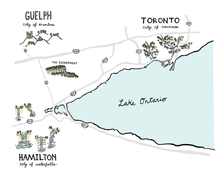
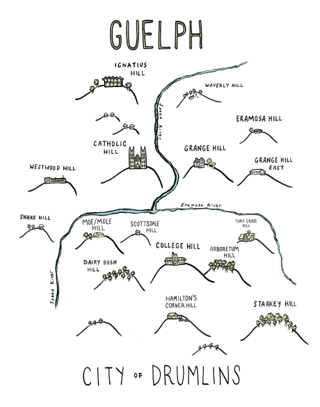
My map (leading image) is an effort to re-assert the geologic features most prominent in these three very connected cities at the western end of Lake Ontario. Happy exploring!

City of Drumlins

Southern Ontario’s physical geography is often ignored – its landscape is often derided as being flat, monotonous and boring.

But don’t let the gigantic highways and big box plazas fool you – this isn’t so! Southern Ontario’s rich glacial soil has been sculpted into dramatic river valleys, cuestas, and rolling hills by millennia of water movement.

In Guelph, the city is characterized by hills – drumlins, shaped by the glaciers. Many of these drumlins, due to their prominence, have been topped by important buildings and landmarks – like the Church of Our Lady, and Johnston Hall at the University of Guelph.

But many have been neglected by Ontario’s relentless grid, with roads cutting straight up the steep side of a hill, unwavering from the grid’s linearity. In recent years, the places of prominence at the tops of these hills have become just another patch of endless development.

In an effort to re-assert Guelph’s hills/drumlins into the consciousness of its residents, I enlisted the trusty power of an illustrated map to emphasize the prominence of the city’s hills in it’s urban landscape (leading image).

Because I’m new’ish to Guelph, I spoke with many longtime Guelphites to make sure every hill was included and properly named — like neighbourhoods, the names of Guelph’s hills are often contested, but after asking many people, I chose the most common names to include on the map.

The map was first released at 2016’s Kazoo! Fest Print Expo – while several Guelphites knew about the city’s hills, many did not know they were drumlins, while many others had never thought of the city’s topography and appreciated the geographic insight.

As your Urban Geographer, I’m motivated to bring the unique and magical elements of the land beneath the concrete into focus. Stay tuned for more maps!


Originally posted on Spacing Toronto

Facing each other across Spadina Avenue just north of Adelaide, the Tower and Balfour Buildings frame a striking entryway into Toronto’s Fashion District.

Previously known as the Garment District, the neighbourhood was home to many of Toronto’s textile workers, who were predominantly Jewish immigrants.

Masterpieces of Art Deco architecture, the Balfour and Tower buildings were originally built to house those garment businesses and their showrooms, raising the prominence of the industry, and the city with it.

Designed by Benjamin Brown in the late 1920s, their towering elegance was symbolic of Toronto’s transformation into a modern metropolis — a financial, cultural and transportation hub with a swelling population over 200 000.

That elegance extended to several other Brown-designed buildings nearby including The Commodore on Adelaide, The New Textile Building on Richmond (now an OCADU building) and the Hermant Building at Yonge and Dundas Square.

Despite defining the city at a critical point in its history, Benjamin Brown has remained relatively unknown.

At a time when people weren’t interested in Toronto’s architectural history, let alone the work of a single architect, Brown’s entire collection of drawings were forgotten about in the architect’s garage and left to deteriorate.

When Brown died, he left the collection to fellow architect Jim Levine, one of the only people who recognized the value of the work.

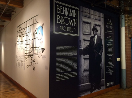
The Ontario Jewish Archives took over the collection in the 80s and has painstakingly restored it, ensuring that a valuable archive of drawings that document the emerging modernity of Toronto was not lost. Highlights of the collection are now on view in an exhibit of Benjamin Brown’s work at the Urbanspace Gallery on the ground floor of 401 Richmond, until April 23.

Screen-Shot-2016-02-16-at-4.51.04-PM

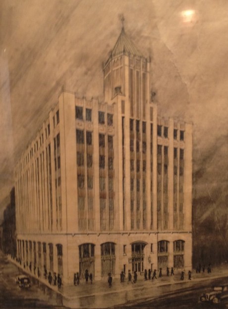
The exhibit is an opportunity to get an up-close view of Benjamin Brown’s expertly executed hand-drawn plans and renderings. Brown was a master of lines. His incredibly detailed drawings even include the buildings’ ornamental windows and decorative stonework.

Brown’s drawings are also poignant portraits of Toronto in the 1920s and 30s, where the aerodynamic shapes and sleek lines of Art Deco and Art Moderne dominated architecture and fashion. In the rendering of the Tower Building, Spadina is bustling with crowds in stylish coats as streamline automobiles motor by.

IMG_9392-768x1042

Brown was one of the first Jewish architects to build and sustain a successful practice in Toronto despite the discrimination within the city in the early 1900s. As a result, he was the architect of many spaces for the Jewish community, including Beth Jacob Synagogue (today, a Russian Orthodox Church) and the Primrose Club on Willcocks, a social club for Jewish men (today, it’s the University of Toronto’s faculty club).

As an artist and urban geographer, I was delighted to participate in the exhibit by illustrating many of Brown’s best known buildings, tracing over his lines and creating a map showing the geographic expansiveness of his life’s work. Indeed, Benjamin Brown has hundreds of commissions spread throughout the city.

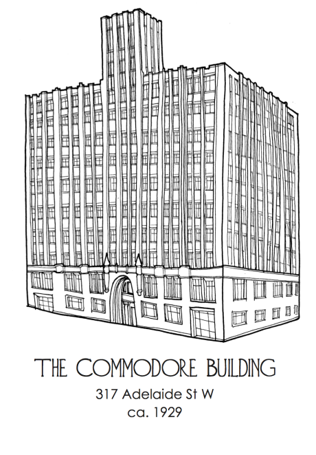
CommMy illustration of the Commodore Building on Adelaide. Unlike Benjamin Brown, I didn’t use a ruler!

Looking at Toronto through the lens of a single architect is an opportunity to make connections between the city’s disparate neighbourhoods and styles. Benjamin Brown’s designs range from the Art Deco towers downtown to utilitarian garages in the west end, storefronts on Bloor and Georgian, Tudor and Colonial Revival houses in midtown.

Through the work of Benjamin Brown, an intelligible thread runs through Toronto, a city indebted to the grandeur he helped established at the turn of the twentieth century.

See the exhibit of Benjamin Brown’s work at the Urbanspace Gallery on the ground floor of 401 Richmond, now until April 23.


This slideshow requires JavaScript.

Benjamin Brown is one of Toronto’s most important, but least well known architects.

Practicing in the 1920s and 30s, his Art Deco towers defined the Toronto’s Garment District when the city was emerging as a modern metropolis.

Beyond the downtown core, Brown’s work can be found throughout the city – store front designs, residential homes, synagogues and community centres.

To illustrate the expansiveness and character of his work, the Ontario Jewish Archives commissioned me to illustrate 15 of Benjamin Brown’s buildings, along with a giant map featuring  a selection of his commissions.

The illustrations and map are up at the Benjamin Brown exhibit at the Urbanspace Gallery on the ground floor of 4o1 Richmond until April 23.

Enjoy digital versions above and samples of the map below, and be sure to check out the exhibit to see the mastery of Brown’s plans and renderings in person!

IMG_9388IMG_9379


Heritage Toronto commissioned me to illustrate their award nomination forms.

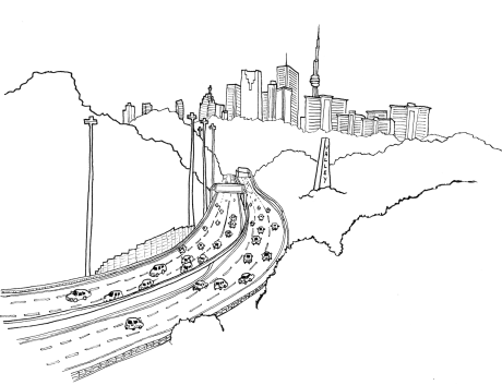
The commission was an opportunity to ruminate on what “heritage” means. Though Yonge & Dundas Square and the Don Valley Parkway aren’t directly the subjects of Heritage Toronto awards, their inclusion on the nomination forms hints toward how we may consider them in the future. Indeed, a decade after Yonge & Dundas Square opened to “consternation”, architectural critics are praising its role in the city.

Don Valley Parkway

Screen Shot 2016-02-15 at 6.12.31 PM

The Hermant Building’s recently restored entranceway

Screen Shot 2016-02-15 at 6.12.26 PM

Community Heritage
Screen Shot 2016-02-15 at 6.12.20 PM

Yonge & Dundas Square
Screen Shot 2016-02-15 at 6.12.47 PM

Short Publication 
Screen Shot 2016-02-15 at 6.12.38 PM

This post first appeared on the Koffler Gallery’s K-Blog, and was written by Jessica Dargo-Caplan. All photos by Mary Anderson. 

Inspired by the Koffler Gallery’s Spring 2015 exhibition Erratics (an art installation which brought together two distinct archives and explored the tensions between memory and fiction by Martha Baillie, and Malka Greene with Alan Resnick), grade 5/6 students from Rose Avenue Public School and Paul Penna Downtown Jewish Day School explored the connections between place, memory and fiction.

photo-1

photo-2photo-3

During this 6-week project, students worked with urban geographer/artist Daniel Rotsztain to build collaborative neighbourhood archives through line drawing, mapping, personal narrative, postcard-writing and exchange.

Daniel leads students on a neighbourhood walks, encouraging them to pay attention to those small but vibrant details, which hold stories and personal memories in neighbourhood landmarks.

photo-4

After the neighbourhood walks, Daniel taught the students how to transfer their sketches into graphic line drawings onto their postcards.

photo-5

Inspired by their line drawings, students write personal narratives about their chosen neighbourhood objects, landmarks and buildings.

photo-6

Daniel works with the students to create a new map of their neighbourhoods, animated by their postcards.

The students from each school then mailed their postcards to the students at the other school, so they could exchange and share their personal perspectives, and create a collective archive of the two school communities, through their eyes and imaginations.

photo-6a

These postcards are just a sample from the collective archive:

photo-6b

photo-7aphoto-7bphoto-8aphoto-8bphoto-9aphoto-10On June 1, after 5 weeks of workshops, the two school groups met at the Koffler Gallery for an informal tour of Erratics, and to see their collaborative Neighbourhood Archives postcard project installed in one of the flex studios at Artscape Youngplace.

photo-11

“Toronto is a city of neighbourhoods that are distinct, but share lots in common. The students from Rose Avenue and Paul Penna compared their two neighbourhoods by drawing hybrid utopian communities along the schools’ shared arterial: Bloor Street.”

– Daniel Rotsztain

photo-12

The teachers at both schools recognized the importance of this cross-cultural dialogue and saw the impact on their students.

“The learning was authentic, deep, and empowering. By exploring the program from the perspectives of social justice, architecture, art, writing, and history, my students now have a newfound and genuine understanding of what’s in their own backyard… and how it all connects to the context of the city around it.”

– Diana FitzGerald, Grade 6 teacher, Rose Avenue Public School

photo-13

Perhaps the truest testament to the project’s success is the way the collective process fostered new community understanding and connections.

“Through all the six years that I have spent living downtown, I had never noticed, never realized, never saw just how many nooks and crannies there were and how much people cared about them. When Daniel [Rotzstain] came, we all became part of this group of people who cared about all of these beautiful places.”

–Grade 5 student, Paul Penna Downtown Jewish Day School

photo-14

Many thanks to the school administration, teachers and students for their dedication and support on this project:

Rose Avenue Public School: David Crichton (principal), Diana Fitzgerald (grade 6 teacher), and their grade 6 students

Paul Penna Downtown Jewish Day School: Laila Lipetz (Director of Curriculum), Edi Fisher, Avee Helfand (grade 5 teachers), and their grade 5 students

And thank you to Daniel Rotsztain, for leading us throughout this beautiful, collaborative project.

You can also read about the project in the August 27, 2015 edition of the Canadian Jewish News 

Koffler CJN

L'heure de pointe de pizza_colour

Inspired by many hungry hours driving on the 401 between Toronto and Guelph. 

This post first appeared on the Koffler Gallery’s K-Blog, and was collaboratively written by myself, Mary Anderson, Mariah Hamilton and Jessica Dargo-Caplan. All photos by Mary Anderson. 

On Sunday, May 3, 2015, the Koffler Gallery organized its first Jane’s Walk, which explored the Urban Legends of our West Queen West neighbourhood. Our walk was created and led by Urban Geographer and artist, Daniel Rotsztain.

Inspired by the Koffler Gallery exhibition Erratics, (which explores the tensions between memory and fiction), Daniel introduced the walk by posing the question, “does Toronto have amnesia?”

Image1_675

Image3_675

Daniel led our group on a 2-hour walk through Toronto’s West Queen West neighbourhood, attempting to reassemble the neighbourhood’s memory by uncovering its histories, urban legends, and everything in between.

Image4_675

“What happens to a city’s notion of history when it has amnesia? A funny thing happens where the lines blur between fact and fiction. Without a strong historical tradition, urban legends emerge to fill the gaps and pass for that history. Strange historical blips, and anecdotal evidence emerge as what we remember. There are zones with strong historical memory, and others that people pass without a thought. But can’t we say that about all history? What distinguishes an urban legend – a story passed down through an oral tradition, from the random facts that become enshrined as historical evidence?” – Daniel Rotsztain

Image5_675

Our second stop was in front of The Lakeview Diner, where Daniel told us about the legend of the Lake Ontario Sea Serpent, which was named Gaasynedietha by First Nations people.

Image6_675

Our third stop was at Crawford and Dundas – where we explored the mystery of the green posts. Are they some sort of escape exits? Super Mario pipe replicas? Or are they berating tubes for a community of mole people, dwelling beneath Toronto? As Daniel explored these urban legends, he pointed out that the posts are actually ventilation stacks for a complex sewer system known as the Mid-Toronto Interceptor.

Image7_675

Our fourth stop was on Crawford Street – the buried bridges of Garrison Creek. Here, we explored the the legends of Garrison Creek, Toronto’s most famous lost waterway, as well as some lesser known facts about the creek including lost visions for its future.

Did you know that you used to be able to navigate the creek by boat, well north of Bloor, and that it was 10 metres wide and 20 metres deep at its largest?

Image8_675

Our next stop led us through the paths of Trinity Bellwoods to the park’s valley, or what it has become affectionately known as the Dog Bowl.

Image9_675

We often hear that Garrison Creek is “dead” or “lost” – but is it really? Here Daniel described some of the legends of Toronto’s zombie rivers, rising from the dead. These lost and buried rivers make themselves known quite frequently – re-emerging during rainstorms and leaching ancient dump chemicals into waterways. “The creek is not dead, but was buried alive!”

Image14_675

We continued our walk through the rest of Trinity Bellwoods to stop at our next location, the Trinity Gates. Just as the topography leave clues of lost rivers, Trinity Bellwoods’ gates are a clue of lost campuses. Here we explored the legends surrounding Trinity College, and other architectural fragments.

Image10_675

On CAMH’s grounds we recalled the history of the provincial mental health institution, and how the original 1850 buildings were demolished, leaving only its walls. Here we also discussed the legend of failed architecture, and the truth of failed governance.

Image11_675

Our next stop was at Dovercourt and Sudbury Streets where we remembered 48 Abell Street – an important building for West Queen West’s early art scene. It has since been demolished and replaced by condos.

Image12_675

We concluded our walk at Queen and Dovercourt, in front of West Queen West’s iconic, You’ve Changed mural. Daniel invited Carrie Lester to lead this portion of the walk. Carrie is a Haudenosaunee storyteller who told us about the meaning of Toronto, the myths and history of the land on which the modern city is built.

Image13_675

The walk brought to light many kinds of urban legends and histories. Stories were told as we attempted to untangle fact from fiction, and knit together our collective histories.

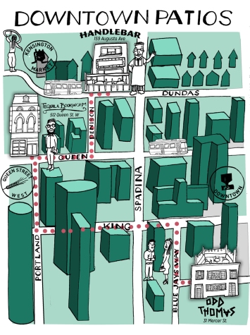
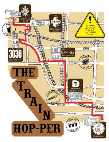
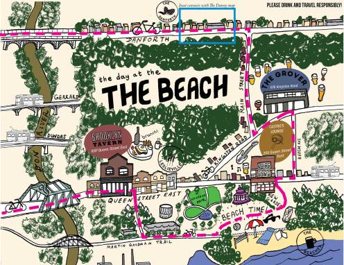
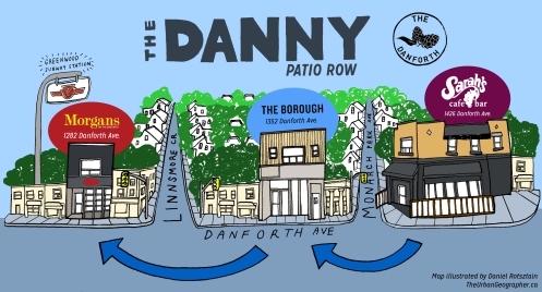
Over the summer, I’ve illustrated a few maps for my friends over at Craft Beer Passport, encouraging its users to fulfill the passport’s motto: “Explore Beer Through Toronto | Explore Toronto Through Beer”.

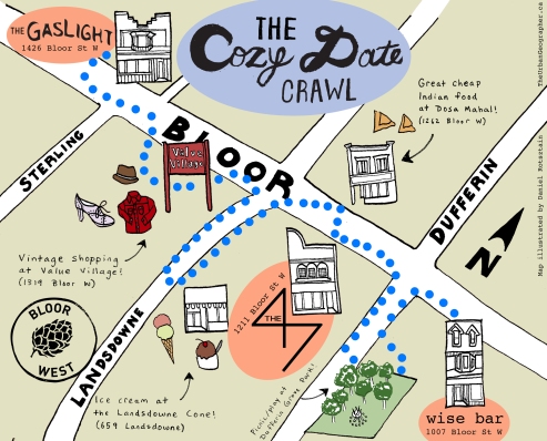
Each map takes cues from its neighbourhood and is themed accordingly. Downtown Patios is a film noir-esque jaunt through Toronto’s most Gotham like quarters. The Train-Hopper is inspired by the train tracks that dominate Toronto’s west end, especially the Junction. Day at the Beach and The Danny are pure explorations of the Beach and the Danforth East, while The Cozy Date crawl indulges in the whimsy of Bloor West.

Enjoy the maps and happy exploring!

Downtown+Patios

Train+Hop-per

The+Beach

Danny+Map_colour_2

Cozy+Date